
Over the last few years, many online retailers decided to go responsive with their eCommerce websites. That’s because they probably found out that most of the traffic on their online store is coming from mobile devices, and here at Nebulab we have seen this trend emerge dramatically also with our clients’ stores.
However many eCommerce owners still tend to focus on the desktop shopping experience instead of the mobile one. Maybe because they didn’t adopt a Mobile First approach at early stages, or maybe because they’re not aware where their traffic comes from.
Making the mobile experience enjoyable and intuitive is crucial to engage your customers so that they will not leave the website quickly.
Here are a few simple tweaks that could improve the mobile shopping experience of your eCommerce.
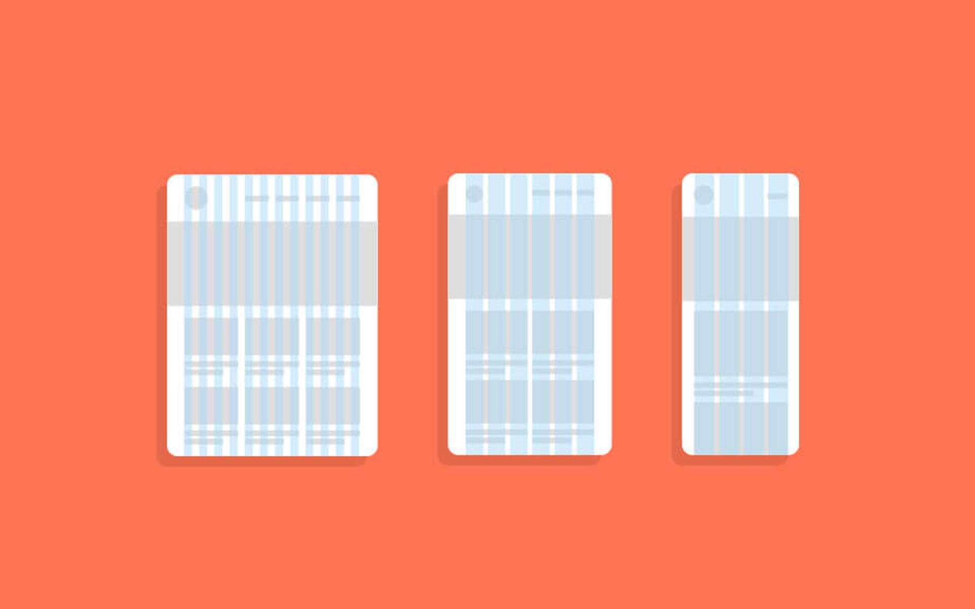
Horizontal Touch Carousel
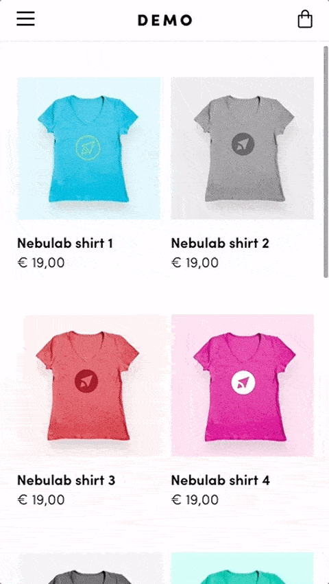
Make sure you’re using an image gallery that supports horizontal swipe gestures, since it’s simpler for a mobile user to navigate through images. Also, to make the user understand that it is a slideshow and not a single image, remember to provide a visible way to navigate the gallery, like bullet navigation.
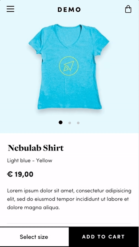
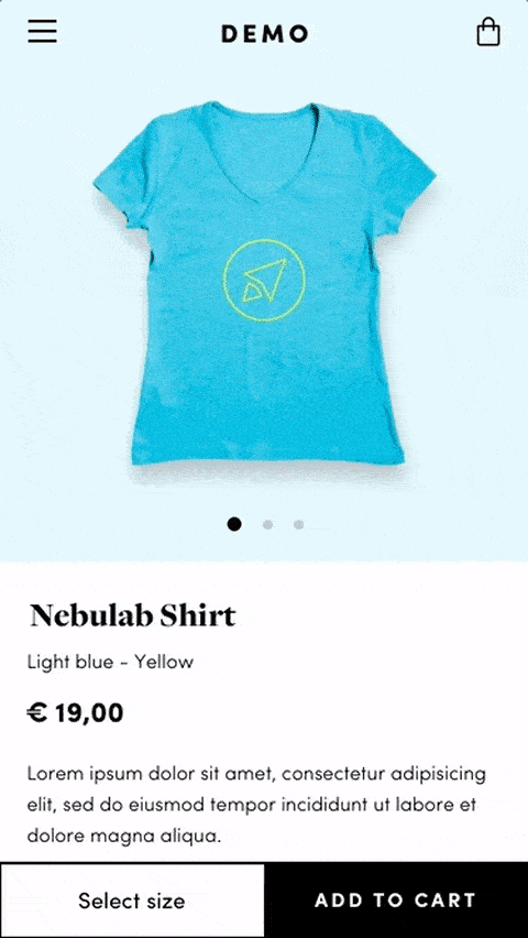
High quality images
In a web page, people usually look at images before content. This happens particularly in eCommerce websites where product images should provide as much information as possible in order to convince customers to buy the product. So make sure you use high-quality images for your products so the they will not look pixelated or lose quality when zooming. And remember that most smartphones, and also some desktop computers such as recent MacBooks, have high pixel density display, which means that your images need to be optimized for such devices. However high-quality images could mean large file size which cause slow website performance. Tools like Compressor.io let you reduce the size of your images without noticeable loss in quality. In addition, I suggest to use vector images (SVG) wherever possible for elements like logos and icons.
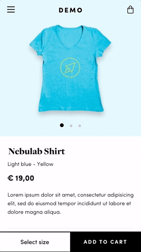
Sticky Add to Cart button
The Add to Cart button is the most important call-to-action of your eCommerce and in order to make it always visible as the user scrolls down the product page, I suggest you to make it fixed at the bottom or at the top of the screen.
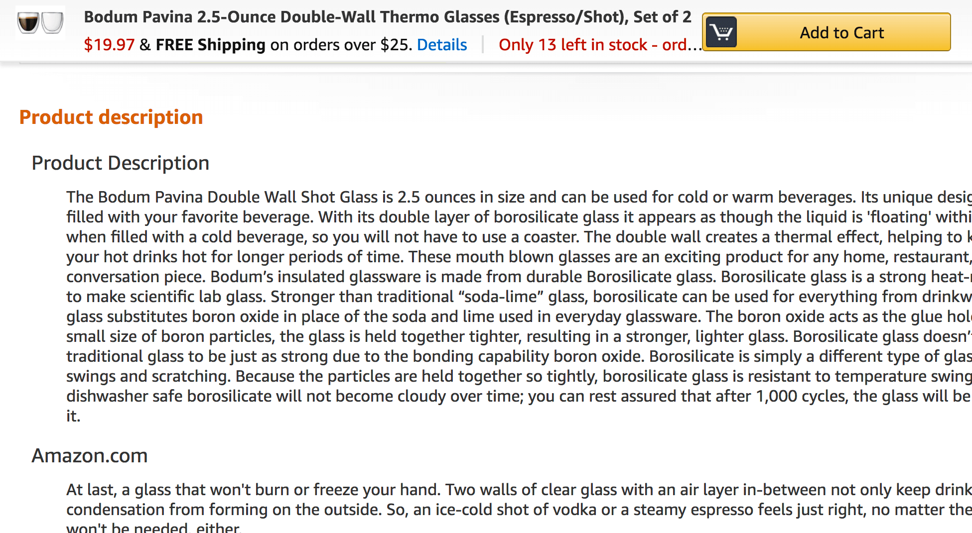
As you can see in the image above, this solution could also be helpful on desktop when there’s a lot of information on the product page and you want to improve your add-to-cart rate.
Fixed header
Web pages could be very long especially on mobile, where content is often “compressed” in order to fit the window width, and sometimes this turns to be annoying for users who want to find essential elements like the website menu or the cart icon. For example, if you reach the bottom of the page and you want to go back to the top and continue to navigate through the website, you have to scroll the whole page again. To avoid this and to speed up the navigation of your website, add an always visible sticky header that follows the user as they scroll the page.
Don’t hide useful information
Sometimes useful information for the user like “Shipping & Returns” or “Size guide” aren’t easy to find in the product page because they are hidden somewhere or only linked in the footer of the website. It’s important to show these info in order to reassure the user and encourage them to purchase. Accordion tabs could be a great solution if you don’t want to increase the length of the page.
Of course these tweaks are not meant to be for everyone, since every website has its own user base and its own market, but they should work for most online shops.
In conclusion, my advice is to put mobile at the center of your eCommerce strategy: considering that more and more people use their smartphone as the only device to browse the web, purchases from mobile will inevitably increase in the future.