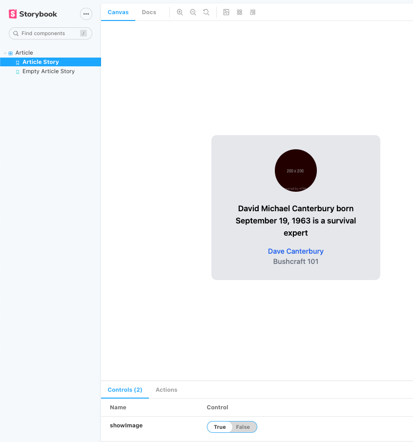
In this article, we are going to show how you can create a NextJs project with Storybook and TailwindCSS.
Before starting, I want to explain who are the actors and why it should be better adding them to our frontend application.
NextJS
NextJS doesn’t need a lot of presentation. If you are here, you probably already know what NextJs is and why we should use it to build robust applications.
NextJs is a great React frontend framework, and it’s mainly used to build SEO-friendly applications since you can use three different types of rendering/pre-rendering methods:
-
SSG (Static-site generation) the HTML is generated at build time and will be reused on each request,
-
SSR (Server-side rendering) the HTML is generated on each request using a node server, so the response is SEO-friendly.
-
CSR (Client-side rendering) the normale React behavior, the response is simply Javascript run by the client.
TailwindCSS
Tailwind is one of the most powerful libraries to build your application style using HTML classes. TailwindCSS implements a ton of dynamic classes which apply different style rules to your application, and it is fully customizable using the configuration file!
Initially it will take time to understand which are the correct classes you need to use to build your interface, but one of the coolest thing in Tailwind is its super documentation.
By the way, the 2.0 version has recently been released with a lot of new features.
Storybook
Storybook is a great library that is mainly used to render our application components outside the NextJs environment. This means that you can check your components UI without making real queries or fetching data. You can also figure out how the application components change based on the passed props.
Storybook is more powerful when used with well-organized components, for example, using [Atomic Design(https://bradfrost.com/blog/post/atomic-web-design/).
Example
You will probably create your custom Button component in your project that will be rendered differently based on the passed props or the fetched data. With Storybook, you can check all the UI changes applying custom props from the Storybook panel or stubbing all your requests.
TL;DR
Here you can find the fully configurated project
Let’s start!
For this article, I won’t split the application into components to be more direct. It would be best to do it in a real application to avoid using the index.js page directly.
The best practice is writing components splitting them by context using a great file structure:
Create the NextJS app
First of all, run this command to create your NextJs project:
npx create-next-app --use-npm nextjs-storybook-tailwindcss
and navigate inside the project directory with cd nextjs-storybook-tailwindcss.
Run your application
npm run dev
Refactor the default code
The create-next-app command creates the project with some unnecessary configuration since we’ll use TailwindCSS to build our style.
Replace the content in pages/index.js with:
const Home = ({ article, showImage }) => {
  if (!article) return "The article wasn't found!"

  const {author, company, image_url, content} = article

  const Image = showImage ? (<img className="w-24 h-24 rounded-full mx-auto md:flex md:self-center"
    src={image_url} alt="A beautiful cat" width="200" height="200" />) : ''

  return (
    <div className="w-96 mx-auto">
      <div className="h-screen flex items-center">
        <figure className="lg:flex bg-gray-200 rounded-xl p-8 lg:p-4">
          {Image}
          <div className="pt-6 lg:p-4 text-center lg:text-left space-y-4">
            <p className="text-lg font-semibold">{content}</p>
            <figcaption className="font-medium">
              <div className="text-blue-600">{author}</div>
              <div className="text-gray-500">{company}</div>
            </figcaption>
          </div>
        </figure>
      </div>
    </div>
  )
}

Home.defaultProps = {
  showImage: true
}

export const getServerSideProps = async () => {
  const response = await fetch('http://localhost:3000/api/article')
  const data = await response.json()

  if (!data) return { props: {}}

  return {
    props: {
      article: data
    }
  }
}

export default Home
Add your first API:
touch pages/api/article.js
const Article = (_, res) => {
  res.statusCode = 200
  res.json({
    id: 1,
    author: 'Andrea Vassallo',
    company: 'Nebulab',
    image_url: 'http://placekitten.com/200/200',
    content: 'The cat is a domestic species of small carnivorous mammal.'
  })
}

export default Article
Remove the CSS file: styles/Home.module.css:
rm styles/Home.module.css


The result is an ugly and boring HTML page.
Let’s go applying our awesome style.
Install TailwindCSS
Why the documentation isn’t enough in this case?
Because NextJS came up with a bunch of pre-configured services like Babel and PostCSS and we have to TailwindCSS with them.*
Reading the TailwindCSS documentation, you’ll see that we need three different libraries to complete the installation:
-
tailwindcss
-
postcss
-
autoprefixer
We don’t need to install postcss and the autoprefixer libraries since they are already installed in NextJs.
Run these commands to install TailwindCSS:
npm install --save-dev tailwindcss
Unfortunately, we can’t use npx tailwind init to create the configuration file since it’ll check if you have installed the autoprefixer library.
Let’s create the configuration file adding the tailwind.config.js file:
touch tailwind.config.js
with the default configuration:
module.exports = {
  purge: [
    // This is not present inside the default configuration
    // but it's good to build your production application
    // Read more about this here: https://tailwindcss.com/docs/installation#building-your-css
    './pages/**/*.js',
  ],
  darkMode: false,
  theme: {
    extend: {},
  },
  variants: {
    extend: {},
  },
  plugins: [],
}
Configure PostCSS
To configure PostCSS we have to override the NextJs default one:
Install the dependencies:
npm install --save-dev postcss-flexbugs-fixes postcss-preset-env
Create the postcss.config.js file:
touch postcss.config.js
and fill it with the default configuration as well:
module.exports = {
  plugins: {
    'postcss-flexbugs-fixes': {},
    'postcss-preset-env': {
      autoprefixer: {
        flexbox: 'no-2009',
      },
      stage: 3,
      features: {
        'custom-properties': false,
      },
    },
  },
}
Add the tailwindcss plugin to the top of the plugin list:
module.exports = {
  plugins: {
    tailwindcss: {},
    ...
  },
}
Include Tailwind in your CSS
Add these three lines of code to the top of this file: styles/globals.css:
@tailwind base;
@tailwind components;
@tailwind utilities;
We made it
Check your application homepage; the result should be similar to this one:


State of mind
From here on, it’ll be a breeze building beautiful component with Tailwind, but we need to answer a couple of questions about testing:
-
How is this component rendered when the article data isn’t found?
-
How can we check all the component variants at any moment without changing the code?
Storybook will help us to accomplish both.
Install Storybook
The default npx sb init command that is used inside the official documentation installs libraries that we don’t need and adds a bunch of files that we don’t use.
For that reason, I usually prefer to use the from scratch configuration.
npm install --save-dev @storybook/addon-actions @storybook/addon-essentials @storybook/addon-links @storybook/react
Add the Storybook commands inside the package.json scripts:
"scripts": {
  "dev": "next dev",
  "build": "next build",
  "start": "next start",
  "storybook": "start-storybook -p 6006",
  "storybook:build": "build-storybook"
}
Copy this piece of code inside the .storybook/main.js file
module.exports = {
  "stories": [
    // Paths to the story files
    "../pages/*.stories.mdx",
    "../pages/*.stories.js",
  ],
  "addons": [
    "@storybook/addon-links",
    "@storybook/addon-essentials"
  ]
}
Copy this piece of code inside the .storybook/preview.js file
// Import the global style enabling tailwind classes
import '../styles/globals.css'

export const parameters = {
  actions: { argTypesRegex: "^on[A-Z].*" },
}
Add a story
For each page or component that we want to tell using a story, we need to create a file called component-name.stories.js.
In this case, we want to create the index.stories.js inside the pages dir:
import Article from './index';

const articleMock = {
  id: 3,
  author: 'Dave Canterbury',
  company: 'Bushcraft 101',
  image_url: 'https://via.placeholder.com/200/200',
  content: 'David Michael Canterbury born September 19, 1963 is a survival expert'
}

const Story = (props) => <Article {...props} />

// Here we export a variant of the default template passing props
export const ArticleStory = Story.bind({})
ArticleStory.args = {
  article: articleMock,
};

// Here we export a variant of the default template passing props
export const EmptyArticleStory = Story.bind({})
EmptyArticleStory.args = {
  article: null,
};

// Here we export the default component that
// will be used by Storybook to show it inside the sidebar
export default {
  title: 'Article',
  component: Article,
  argTypes: {
    showImage: { control: 'boolean' },
  },
};
Run the Storybook server
npm run storybook

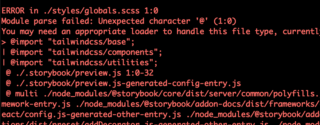
At the time of writing there is a chance you might run into this bug. You can fix it with this solution.
That's all
Your project is ready to be built using a robust framework and beautiful style with an easy way to check component behavior in isolation!
I hope that you found this article helpful and easy to read.
Do you need the Typescript version? Let us know with a comment.
Follow up story - use TailwindCSS and Storybook with SCSS
NextJS side this isn’t a problem, you need just to install the scss library using npm.
npm install sass
Rename the styles/globals.css to styles/globals.scss and fix the _app.js and .storybook/preview.js style imports.
and replace the TailwindCSS style import from this:
@tailwind base;
@tailwind components;
@tailwind utilities;
to this:
@import "tailwindcss/base";
@import "tailwindcss/components";
@import "tailwindcss/utilities";
And Storybook?

It seems that Storybook doesn’t recognize the SCSS syntax, and for this reason we need to extend the library Webpack configuration adding the sass loader.
The Webpack loader is used starting from the end, and this means that the sass-loader should be added at the end of the loader list.
Here you can find the .storybook/main.js file with the correct configuration:
module.exports = {
  stories: [
    // Paths to the story files
    "../pages/*.stories.mdx",
    "../pages/*.stories.js",
  ],
  addons: ["@storybook/addon-links", "@storybook/addon-essentials"],
  webpackFinal: async (config) => {
    config.module.rules.push({
      test: /\.scss$/,
      use: [
        "style-loader",
        "css-loader",
        "postcss-loader",
        // Add the sass loader to process scss files
        "sass-loader",
      ],
    })

    return config
  },
};


