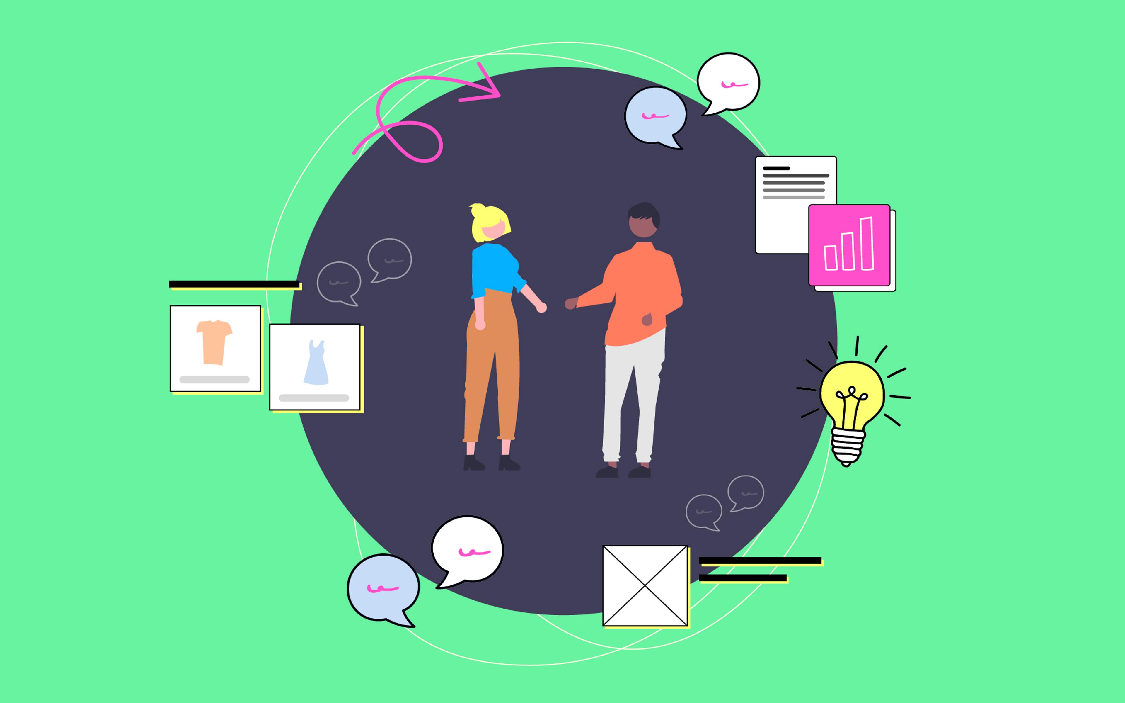
In July this year, we announced Sprout, our product gifting app.
Sprout allows brands to efficiently run product gifting campaigns without going crazy: rather than spending days buried in Instagram DMs and spreadsheets, brands can just connect their Shopify store, set up a gift link, and share it with the influencers they want to partner with. Influencers can use the link to select the product(s) they wish to receive and enter their shipping information, and an order appears in the brand’s Shopify dashboard, ready to be fulfilled by the brand’s team. It's as simple as that!
After beta testing our MVP with some customers for a few months, we got to work on our public launch. We had a pretty ambitious goal: we wanted to have a brand and website ready to go in just two weeks so we could start marketing the app to the general public.
In this article, we’ll show you how we met our deadline by following a strict design review process and using the right tools.
Solid Branding Means Fast Execution
Branding is much more than having a good-looking, distinctive logo. For us, branding is about capturing the identity of a company or product, and then translating that into a visual foundation that can be used across the product’s properties. A solid brand allows you to move quickly and confidently, no matter what kind of digital or physical experience you’re working on, and it makes you immediately recognizable by prospective and existing customers.
As always, we started by defining a compelling positioning statement and researching Sprout’s target audience and competitors. Our goal in this phase is to understand what the brand stands for: is it a disruptor, fun and playful? Or is it the real deal, serious and professional? How does the brand relate to consumers? How does it relate to its competitors? Once we had defined and finalized all these elements, we began translating them into a visual identity.
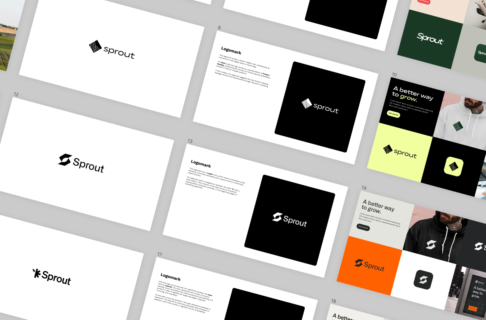
For the visual identity, we vowed not to exceed three iterations–our goal was to have the final version ready in one week, and then move on to designing and implementing the website.
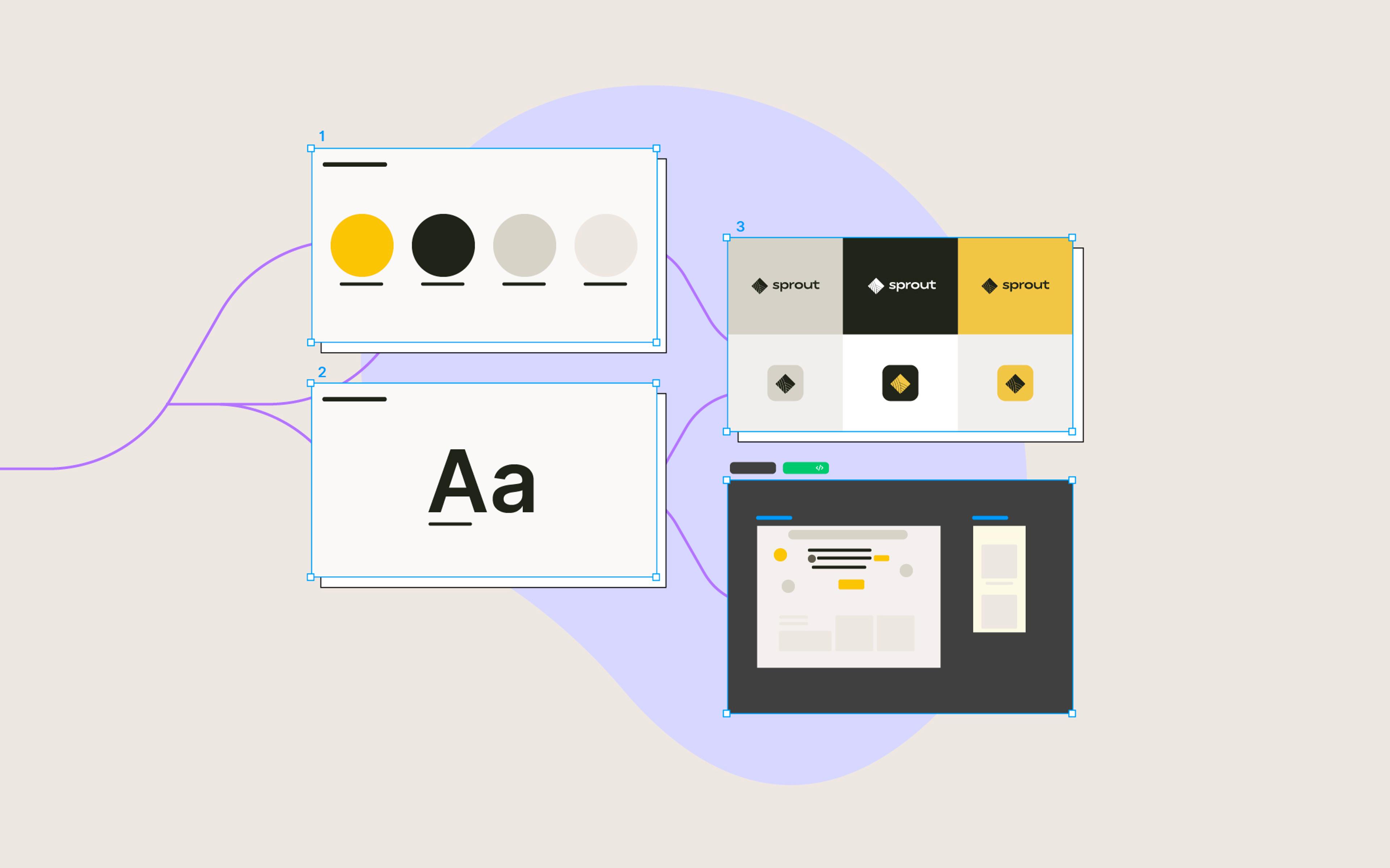
In our first round, we developed four brand directions, exploring different logos and mood boards representing various archetypes or styles.
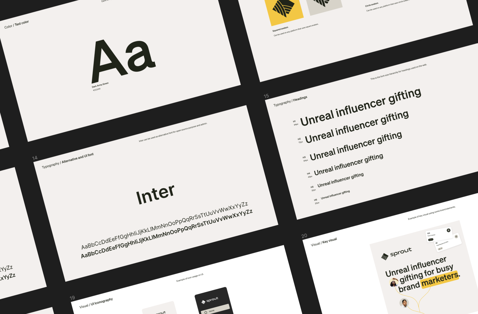
This was super helpful in defining the visual communication we wanted to adopt, including the color palette and font combinations.
In the second round, we mixed and matched elements from the different proposals, settled on a logo and overall mood, and then started exploring different color palettes and font families.
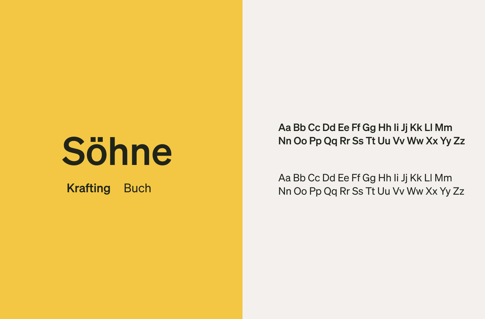
In the final round, the work was nearly complete, and most of the decisions had been made. The rest was a matter of refining a few aspects of the color palette, typography, iconography, and overall visual style so that we could more easily reference them in our subsequent work.
At this point, we had established a brand identity and created a style guide to guide us while implementing the brand. We could finally focus on our website.
Going From Figma to Finished Website in One Click
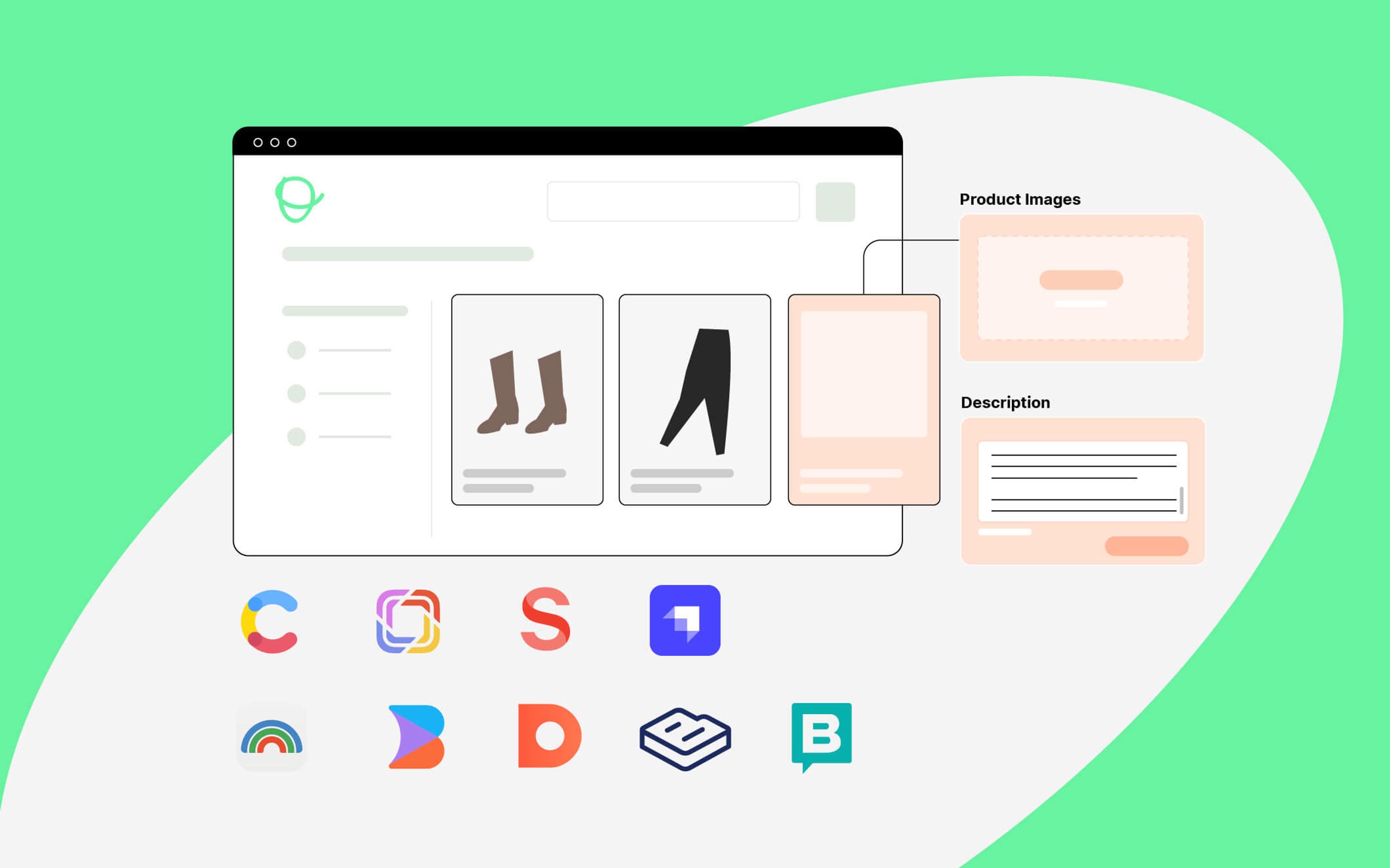
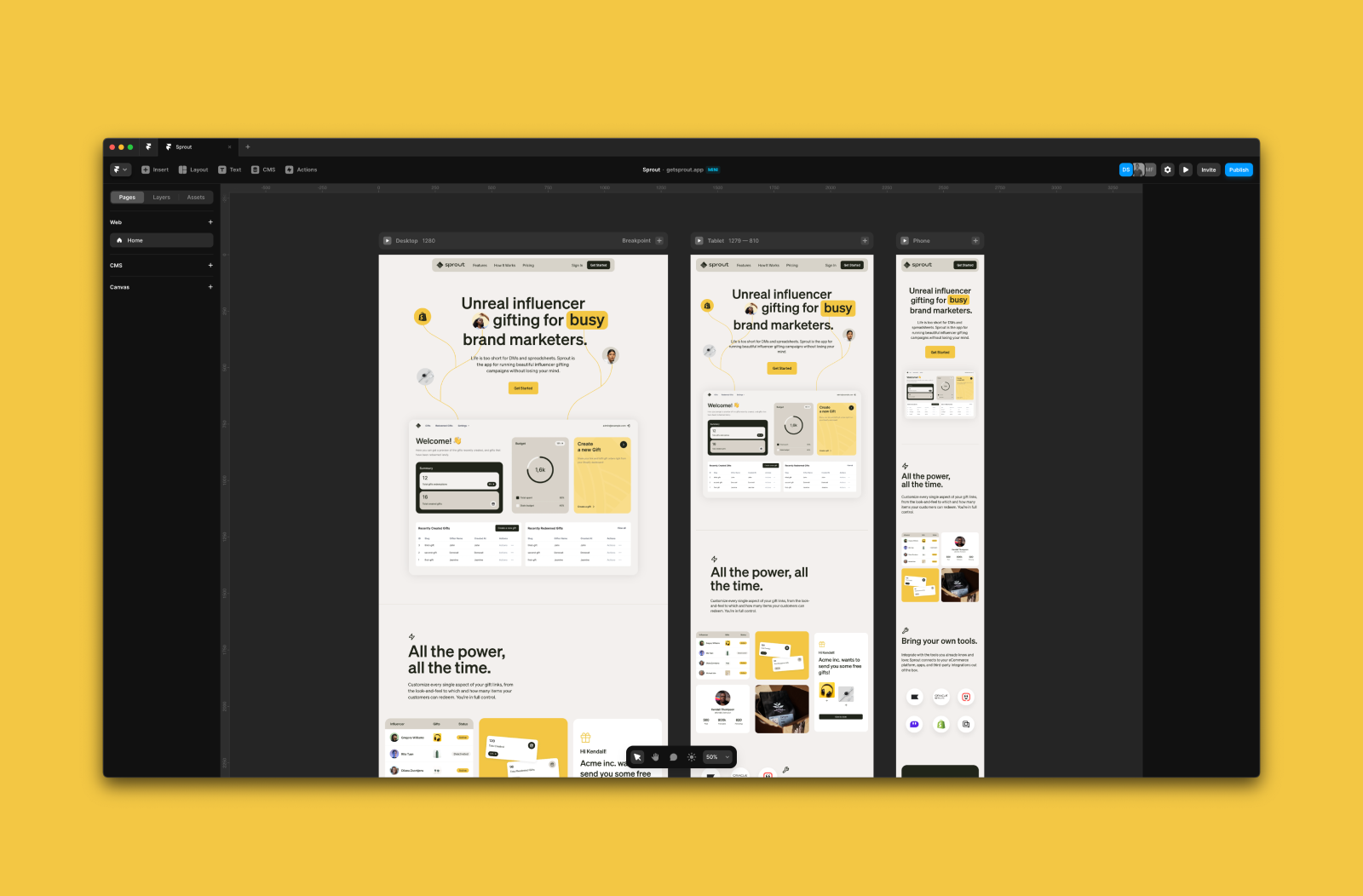
Figma has been our design tool of choice since its release, so it’s no surprise we also used it for Sprout. We created a quick landing page showcasing the product’s capabilities and most common use cases and allowing brands to request a demo. Because we had defined the brand’s visual identity and UI fundamentals in advance, the original website design only underwent minimal modifications before being approved for publication.
After finalizing the design in Figma, we typically hand it off to the engineers, who build it using whatever frontend stack has been adopted. This process leads to highly polished and sophisticated UIs but also takes more time as the engineers need to translate the designs into code and test and deploy the result.
With our two-week deadline, we needed a radically different approach: ideally, we wanted to go from Figma to the final website in one step. We also needed the ability to quickly make visual and content changes to the website after the initial publication to accommodate whatever feedback we received from existing and prospective customers.
We evaluated different content management options and ended up using Framer. Here’s why:
- As long-time Figma users, the Framer UI feels very familiar, and the app is incredibly user-friendly.
- Framer allows importing Figma designs by simply copying and pasting the artwork, which is game-changing for a fast-moving team.
- The Publish feature is straightforward and blazing fast: we purchased a domain and were ready in minutes.
- Framer integrates with MailChimp, Formspark, and other tools that we use for marketing and lead generation, which further reduces development time.
After importing our designs into Framer, we only had to make a few adjustments to some elements, add some animations, hit Publish, and voilà! Our website was online and available to the world in one week and with zero lines of code. Not only does it require zero maintenance, but anyone with access to the Framer project can easily make content and visual changes to the website.
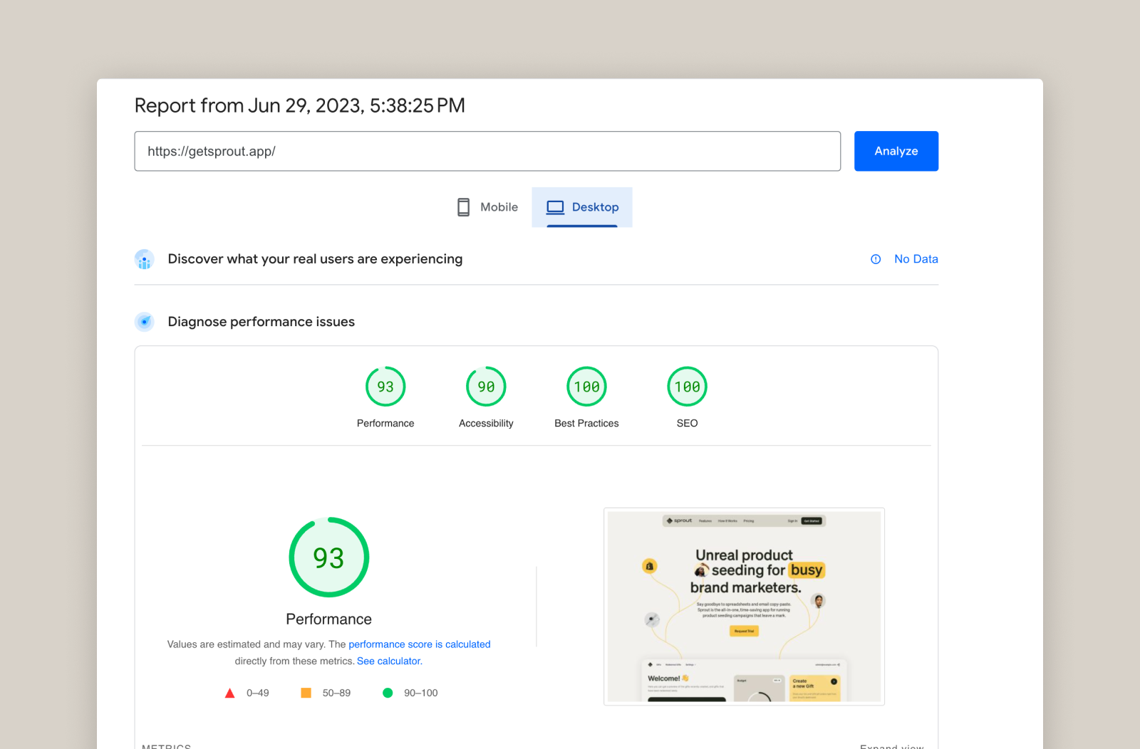
Finally, we were impressed with the site's performance: even though we didn’t spend time optimizing it, it got top scores in all areas of Google’s PageSpeed Insights benchmarks–hooray for SEO!
Use Guidelines and Constraints to Your Advantage
While an established work process improves your team’s long-term productivity, it can sometimes hinder your goals and even impede learning. Setting an arbitrary deadline forced our team to think outside the box and temporarily move away from our typical design-development handoff process. This allowed us to go from zero to a fully established brand and website in under two weeks.
Of course, none of this would have been possible without a solid brand in place. By establishing a clear visual identity beforehand, we minimized the communication overhead while creating Sprout’s website, drastically improving our turnaround time.
We will probably re-implement Sprout’s website with a more sophisticated tech stack at some point, but for now, we’re thrilled with Framer’s ease of use and flexibility. In fact, next time we do something like this, we might even try designing the website right into Framer rather than going through Figma–who knows, we might be able to shave a couple more days off the timeline!
If you’re an e-commerce brand and would like to adopt a similar approach for your next landing page or product drop, feel free to reach out! We’d be happy to help.