
With customer acquisition costs increasing by 222% between 2013 and 2022, modern brands must maximize retention and customer lifetime value. Over the last years, several brands have looked at subscriptions to help mitigate this challenge: by putting future purchases on autopilot, subscriptions can boost purchase frequency and drive more sustainable growth.
As more brands adopt subscriptions, however, many consumers have also begun experiencing subscription fatigue, which has led to a slew of cancellations. This trend can only get worse with the recent challenges in the macroeconomic environment, as consumers look to acquire greater control over their spending and cut back on unnecessary purchases.
In other words, subscriptions are a great business model, but they’re becoming increasingly challenging for e-commerce businesses to execute.
This is a complex, multi-faceted challenge that would take several blog posts to unpack. Today, we’d like to start by offering some tactical advice on how you can improve the pre-checkout UX of your subscription offering and incentivize more customers to subscribe based on our experience with brands such as Cometeer, MeUndies, and Blue Apron.
#1: Create a “How It Works” Section
Every online store that offers subscriptions should have a “How It Works”section. This section can be a standalone page or embedded in the home page, landing page, pricing page, or any other prominent touchpoint on your e-commerce site.
A good How It Works section equips consumers with all they need to know about your product, pricing, and delivery options. It can be a significant make-or-break moment in the consumer’s decision-making process.
In our experience, a good How It Works page design covers:
- Benefits, not features: It goes without saying, but you should tell customers not just what you sell but also why it’s relevant to them. It’s good to know your meal delivery service only ships organic ingredients–but why should they care?
- Subscription options: Do you let customers pause, skip, and cancel deliveries at any time? (Hint: You should.) Say so! Let your customers know they will still have complete control and flexibility in managing their subscriptions.
- Social proof: UGC is always a critical component, but it becomes even more important with a subscription model, where there’s a significant trust barrier to overcome. Show your best reviews–even better if you include images/videos!
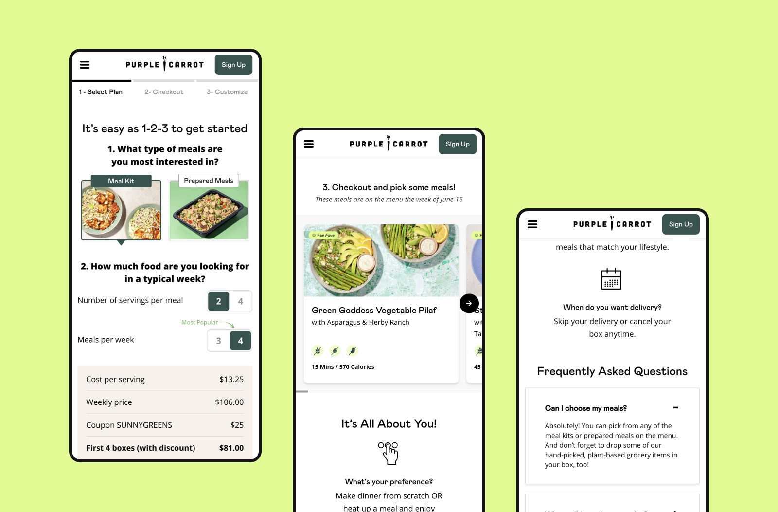
For example, Purple Carrot uses its Pricing page to guide aspiring home chefs through its plant-based meal delivery service. This page helps customers complete the purchase by clearly outlining the high-quality nature of their product, per-meal pricing, and delivery and subscription management options. (But it could still be improved by adding some social proof!)
#2: Put Your Pricing Front and Center
While new customers may be willing to splurge on a one-time purchase, they will often want reassurance they’re getting the best value for their money when committing to a recurring subscription.
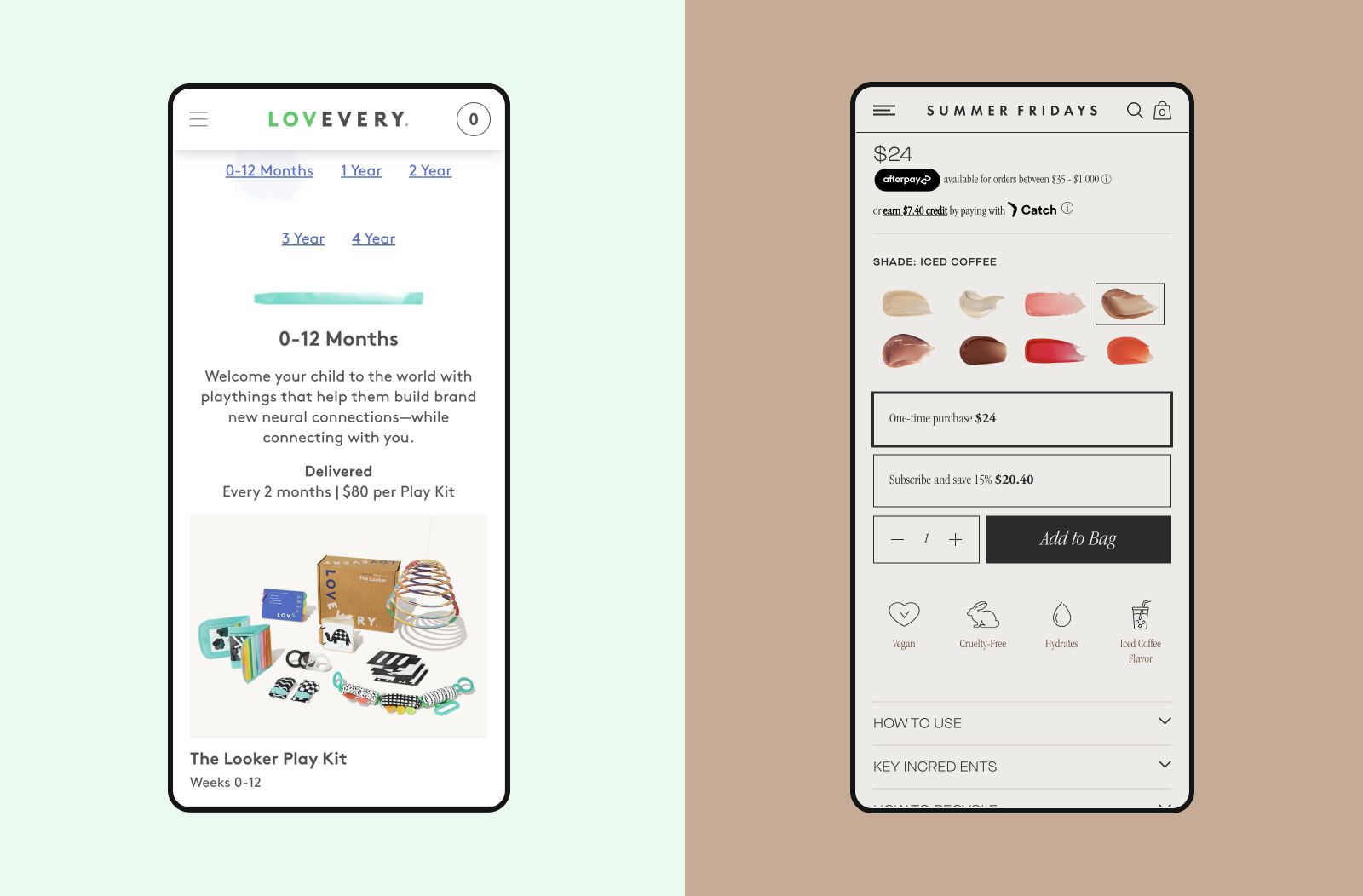
The first step is to make your pricing clearly visible. It seems simple, but you’d be surprised how many brands hide their pricing information in the product details or hard-to-spot sections of the page–see Lovevery or Summer Fridays, highlighted below, as an example.
To improve the visibility and clarity of pricing, consider playing with:
- Text size: Adjust text size so it stands out from surrounding content.
- Contrast: Use contrast effectively to make text pop against its background and nearby items, enhancing readability.
- Whitespace: Incorporate white space to declutter the page, making important information easier to locate and the layout more appealing.
Whenever possible, you should also try to break down your pricing in clever ways that highlight the value of your product. For example, meal delivery services typically use “cost per meal” as the north-star metric, as it helps customers clearly understand how much they’re spending to feed themselves and their families.
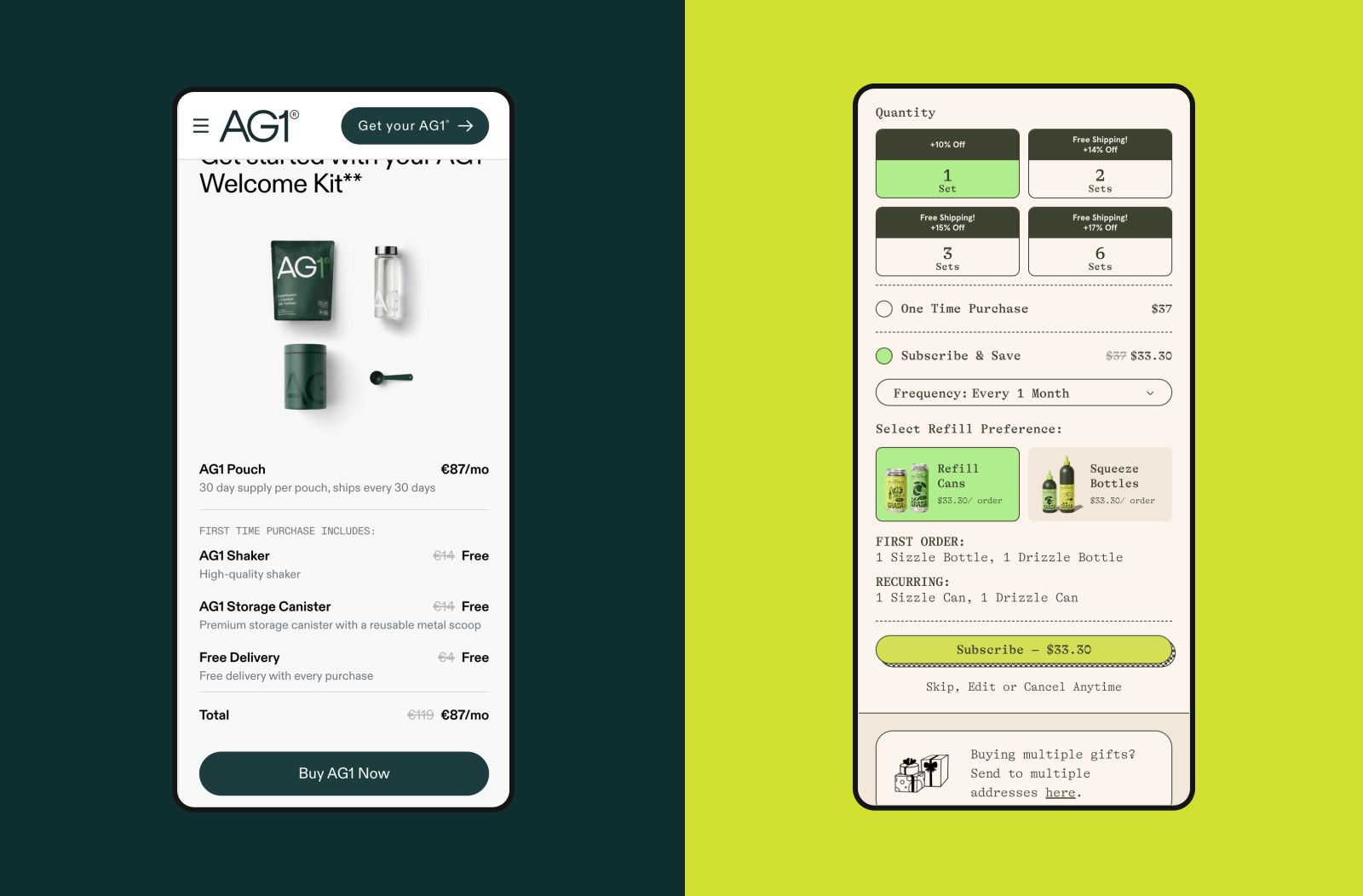
Finally, featuring pricing on other key touchpoints, such as the homepage page, as done by Athletic Greens, can significantly enhance user experience. Graza also does a great job by detailing pricing information for first and recurring orders directly in the Buy section.
Refining these elements can dramatically improve navigation and satisfaction, steering users from curiosity to commitment.
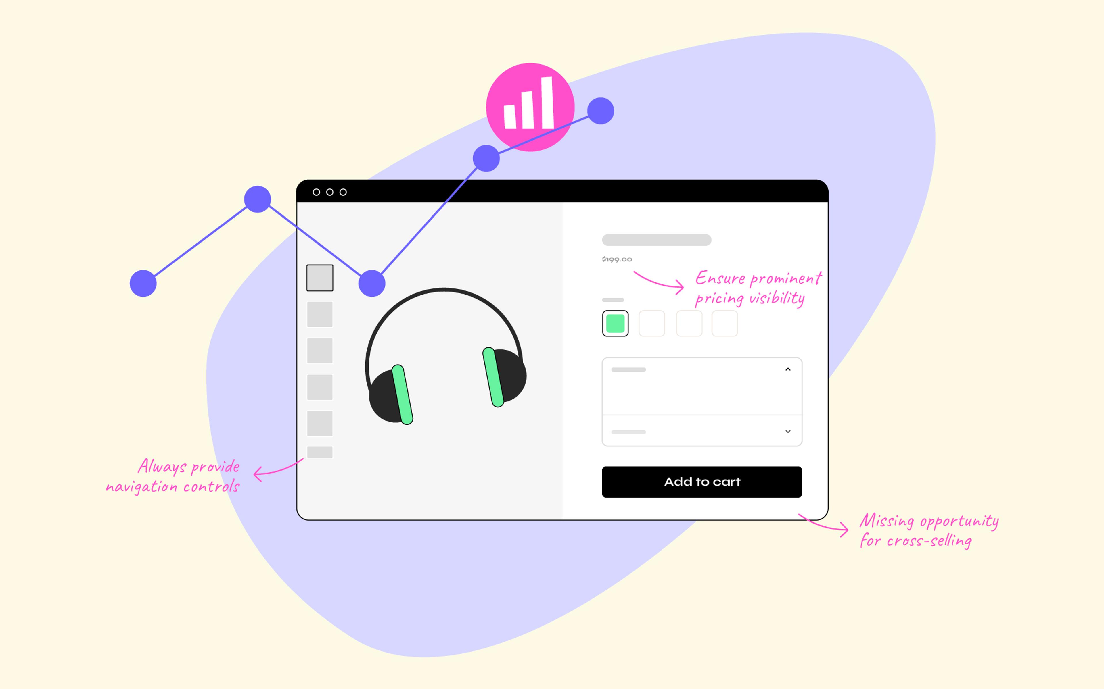
#3: Don’t Rush Customers to Checkout
When brands use calls to action (CTAs) like "Get Started," they often rush the customer straight into the checkout process. Yet many users interpret such CTAs as an invitation to start exploring the brand, not to immediately commit.
While it might sound counterintuitive, we often advocate for brands not to disorient or frustrate users by teleporting them to the PDP or–worse–the checkout funnel if they haven’t had a chance to learn about the brand yet.
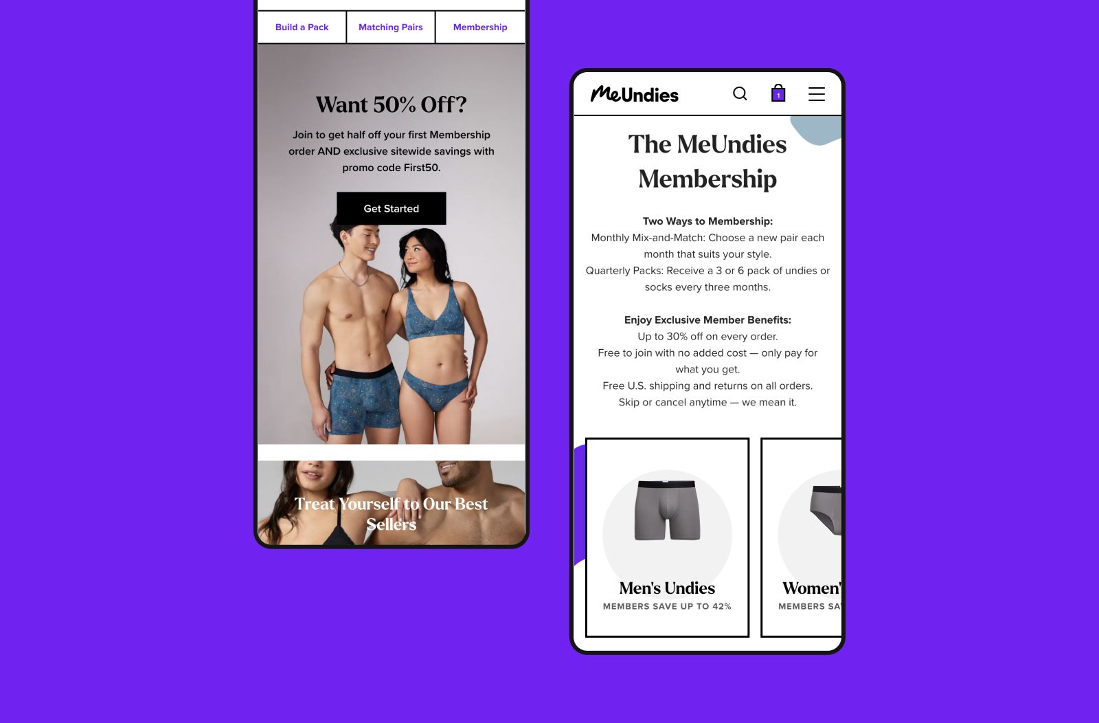
MeUndies, a Nebulab client, knows this very well. They link the “Get Started” CTA on their home page to the “How It Works” page. They don’t ask for the customer’s personal information until much later in the customer journey.
By earning the customer’s trust with content and data before moving into the actual checkout funnel, brands can create a smoother experience, reducing friction and increasing conversion rates.
Bonus: Optimize Your Quiz Experience
While quizzes are not exclusive to subscriptions, subscription brands often use them to help prospective customers find the ideal product variant, subscription plan, and delivery frequency.
As a bonus, here are some tips on how to nail your quiz’s customer experience:
- Offer an ETA: By clearly stating the number of steps and completion time of your quiz, you can proactively manage customer expectations and increase engagement. Of course, this only works if your quiz is actually quick!
- Allow moving back and forth: Customers should be able to move between different steps of your quiz and revisit previous questions without starting from scratch. You should also ensure that navigation is consistent with your site’s design.
- Store user progress: Ideally, you should store a user’s progress as they go through the quiz so they can resume it later. Pro tip: Just like you send cart abandonment emails, ask for the customer’s email upfront so that you can enroll them in a “quiz abandonment” flow if needed!
These tips will help create a smooth and pleasant quiz experience, which can dramatically impact your add-to-cart and conversion rates.
Ready To Master Your Subscription UX?
Here's a brief refresher on the best practices that can elevate your subscription service:
- Craft a compelling "How It Works" section that focuses on benefits rather than features, clearly outlines delivery and subscription options, and establishes credibility through social proof.
- Put pricing front and center, not just on the PDP but also at other touchpoints in the customer journey. If possible, break down your pricing to demonstrate the value you deliver.
- Rather than sending customers from your homepage straight to the PDP or checkout, focus on educating them on the value of your offering and only then closing the sale.
And our bonus tip: if you have a quiz functionality, allow your customers to navigate back and forth between steps and store their progress for later.
If you need UX design for your subscription offering, we can help! Since 2011, we’ve been helping brands anywhere from pre-revenue to $500M/year with the design, launch, and optimization of their subscription experience. Feel free to reach out!