In the DTC landscape, where every pixel of your e-commerce site holds the potential to captivate customers and drive sales, the significance of a robust design system cannot be overstated. It's not just a luxury anymore—it's a necessity.
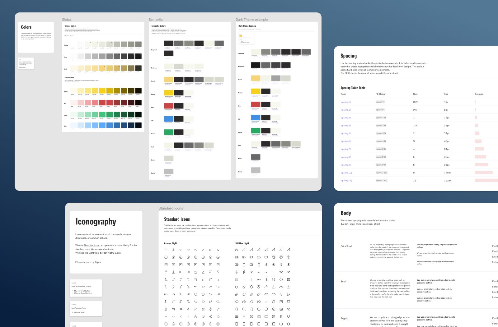
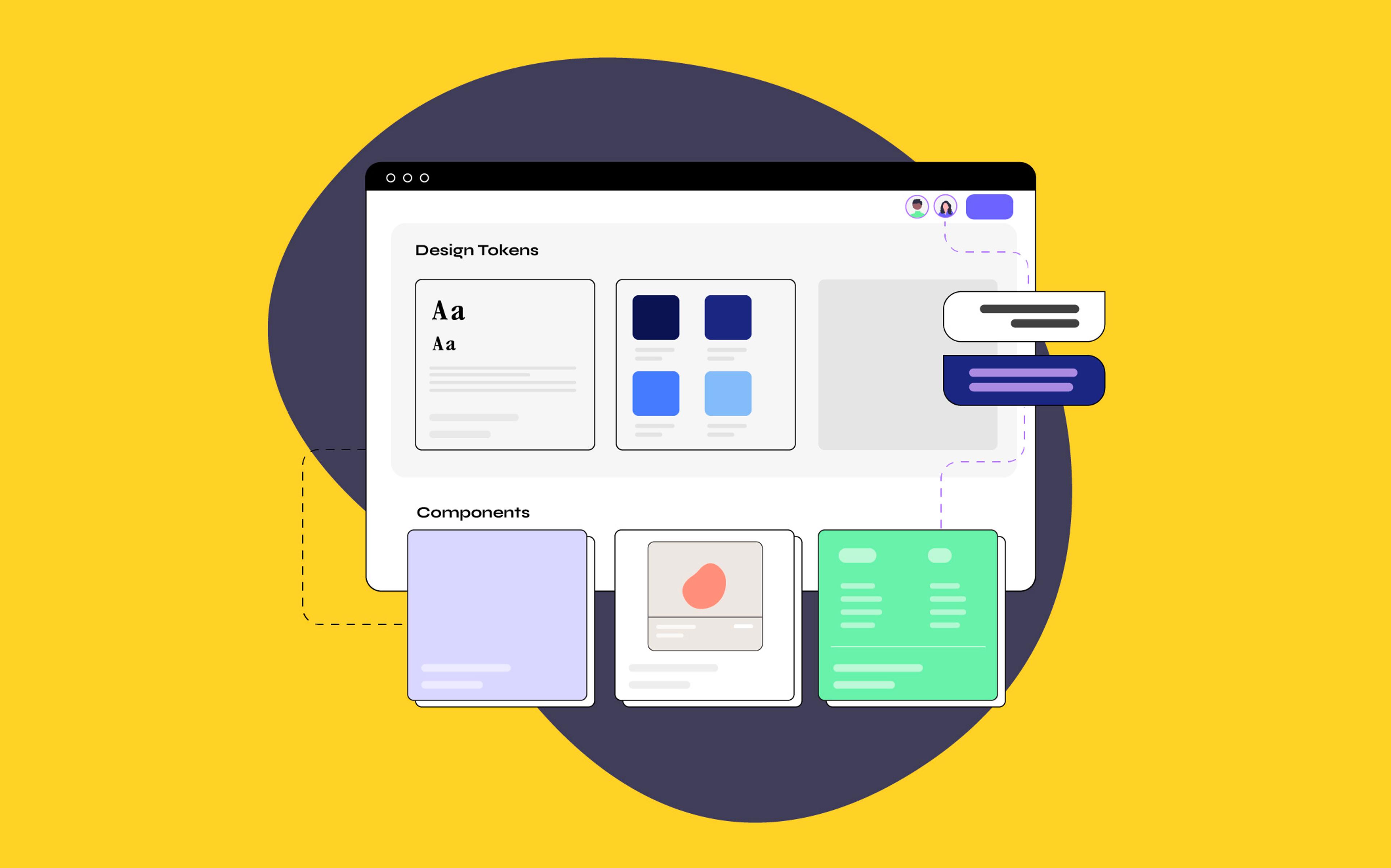
A design system comprises patterns and methodologies that assist not only designers and developers but also product managers and marketers in creating cohesive and user-friendly digital products. While various models exist, most encompass a pattern library, design tokens, brand and style guidelines, along with documentation detailing the system's usage.
At its core, a design system is the backbone of your brand's digital identity, ensuring that as your e-commerce business scales, every page, button, and interaction maintains a consistent brand image and delivers an optimized user experience.
But diving into the world of design systems can often leave brands navigating a maze of challenges, especially under the relentless pressure to rapidly deliver fresh, compelling landing pages and new features. That's where the magic of design systems truly shines—by providing a reservoir of pre-built components and guidelines, they turbocharge the creation process, allowing your team to keep pace with demand without sacrificing quality.
Explore the power of design systems to transform your digital journey and drive success in the competitive e-commerce landscape.
How Design Systems Accelerate Time to Market
In a traditional scenario, the journey of redesigning product pages begins with designers crafting prototypes. These prototypes then undergo a series of checks: stakeholders review, QA stages with engineers, validation by UX researchers, and eventual exposure to a segment of the site’s visitors for performance evaluation through A/B testing. Multiple design iterations are crafted and assessed, with many discarded in pursuit of the optimal solution. This iterative process is vital to ensure only the highest quality updates reach the entire customer base. Yet, the involvement of various teams and multiple revisions makes it inherently time-intensive.
However, with the aid of a design system, the approach is streamlined to fewer phases, significantly accelerating the design-to-production timeline. Tools like Figma provide a collaborative environment where designers can rapidly prototype by pulling pre-defined components and patterns into their workspace, cutting down prototype creation from days to hours.
But the efficiency doesn't end there. Developers can swiftly compile new features by accessing the same pool of components, bypassing the need for detailed visual direction for every interface. Tools like Storybook become invaluable in this context, enabling the isolation and coding of UI elements for seamless integration. This streamlined workflow ensures that projects progress swiftly from ideation to implementation, allowing teams to deliver high-quality updates in a fraction of the time.
Implementing a Design System: First Steps for E-Commerce Brands
A style guide is an artifact of design process. A design system is a living, funded product with a roadmap & backlog, serving an ecosystem. — Nathan Curtis
The journey towards a comprehensive system that aligns with Nathan Curtis's vision—a "living, funded product with a roadmap & backlog, serving an ecosystem"—might feel overwhelming. Yet, the truth is, embarking on this path doesn't require an army. It's about smartly leveraging what you have and starting somewhere meaningful. Let's explore practical steps to initiate and nurture a design system with your current resources.
-
Conduct a Design Audit: Begin by taking stock of your current design elements across all digital assets. This includes colors, fonts, button styles, and any reusable components. The goal here is to identify inconsistencies and opportunities for standardization. A comprehensive audit paves the way for a more cohesive digital presence. FigJam is a great tool to kickstart this first step and to keep all the screenshots accessible to everyone on the team.
-
Assemble a Cross-Functional Team: This doesn't mean hiring new roles but individuating people across existing departments who will be responsible for creating and maintaining the design system. Even a small team, comprising a designer, a developer, and a product manager, can kickstart the process. Their diverse perspectives will shape the design system to be both usable and technically feasible.
-
Create Design Tokens and Components: Start by standardizing the most frequently used elements. Design tokens are the building blocks (like colors, typography, and spacing) while components are reusable UI elements (such as buttons, and input fields). Focusing on these foundational elements is essential to pave the way for creating patterns (components that come in a specific combination).
-
Set Up Documentation: Initially, your documentation could be as straightforward as a shared online document or a simple internal wiki. Maintaining the same structure (tokens, components, patterns) and vocabulary of your design system is the key to fostering accessibility and clarity.

Remember, the essence of a design system is to foster efficiency, consistency, and innovation across your online store. Starting small and scaling thoughtfully can lead to significant long-term benefits, setting a strong foundation for growth and adaptation.
Overcoming Obstacles to Adoption
Introducing a design system might initially meet with skepticism from your teams. Overcoming this involves embracing a culture of collaboration and shared ownership. As discussed in Boost Your eCommerce Team’s Productivity with Open Design, developing an open design process is essential for fostering broader adoption of the design system throughout the organization.
Demonstrating the design system's value through small, visible projects that improve the e-commerce experience—such as improving the navigation bar or updating product grids for holiday sales—showcases the practical benefits. These successes not only build confidence in the system but also serve to highlight its effectiveness in real-world applications.
Organize hands-on sessions where stakeholders from different teams—be it design, development, or even marketing—redesign an e-commerce product page or streamline the checkout flow using the design system components. This is a great opportunity to turn skeptics into advocates (and they can have fun doing it, too!).
A design system’s value is realized when products ship features using parts from the system.
— Nathan Curtis
Tips on Scaling Design Systems
As your e-commerce brand navigates through various stages of growth, the need for your design system to adapt and scale becomes increasingly apparent. A scalable design system not only ensures consistency across your digital presence but also facilitates a more collaborative and efficient workflow as your team expands and your product offerings diversify.
Here are some practical tips on achieving just that, ensuring your design system remains a thriving, integral part of your brand's evolution:
-
Foster Shared Language: In a design system, a "primary button" component is defined with specific attributes such as size, color, and behavior. This terminology is consistently used by both designers (on Figma) and developers (on the code), ensuring seamless communication and alignment throughout the project.
-
Prioritize Regular Reviews: Schedule frequent review sessions dedicated to assessing and updating the design system. These reviews are opportunities to adapt to new brand needs, incorporate feedback, and integrate emerging design and tech trends.
-
Encourage Contribution: Organize workshops to make the design system a collaborative project where team members can contribute ideas, feedback, and improvements. This not only keeps the system dynamic but also fosters a sense of ownership among the team.
-
Document Religiously: Keep comprehensive and up-to-date documentation of the design system. The documentation can be on Figma, a separate document, or a tool. It can even be a website, it depends on project dimensions. With Shopify Polaris, Shopify provides clear and accessible documentation to streamline the design and development process for Shopify merchants and partners.
Implementing these strategies can help your design system remain a vital, evolving asset that supports your brand's growth and adapts to its changing needs.
Design Systems: The Blueprint for E-Commerce Excellence
In wrapping up our journey through the landscape of design systems, e-commerce brands must grasp just how vital these frameworks are. At the heart of it, design systems foster higher quality products and markedly enhance the user experience. One of the standout benefits is scalability. As your brand grows and your digital footprint expands, a design system ensures that scaling up doesn't mean starting from scratch every time. This seamless scalability goes hand in hand with maintaining brand consistency—vital for cultivating brand recognition and trust among your audience.
Moreover, design systems contribute to better website performance. By eliminating repetitive components and streamlining the design-to-development process, websites become leaner and more efficient. With a design system in place, accessibility is not the only built-in standard; for brands eyeing the global market, having a design system is a strategic step for embedding localization best practices right into each pattern, ensuring that your brand resonates with diverse cultural sensibilities —as we explained in Expanding Your Brand Globally With Cross-Cultural Design.
Embracing a design system isn't merely an operational upgrade; it's a commitment to elevating your brand's digital presence, ensuring that every interaction your customer has with your brand online is as intuitive, engaging, and memorable as possible. As you consider the next steps for your online store, remember that a design system offers more than just a collection of components. It's a pathway to crafting experiences that truly resonate, setting your brand apart in the competitive digital marketplace.


