Picture this: You run an eCommerce store, and business is booming in your home country. Feeling confident, you decide to expand into new markets. You translate your website into a few languages, but something's amiss. Your sales aren't hitting the expected numbers, and customers seem less engaged. What went wrong?
This is where Cross-Cultural Design comes to the rescue. Cross-Cultural Design (CCD) recognizes that every culture is unique and influenced by its values, traditions, and preferences. Ignoring these cultural nuances can lead to missteps, missed opportunities, and the alienation of potential customers.
In this article, we'll take you on a laid-back journey through the exciting world of CCD, explaining why it's a game-changer and how to navigate it effortlessly.
The Principles of Cross-Cultural Design
Thinking about how cultural differences can influence users' needs and expectations isn’t an easy task, and we at Nebulab know it very well: we’re not only fully distributed, but we also work with brands from all over the world. Local preferences, navigation, and information hierarchy are just some of the aspects that can be influenced by cultural, behavioral, and economic elements.
In theory, User Research should help designers understand what their audience expects from digital interactions. Unfortunately, most behavioral research studies–which User Research practitioners take a lot of inspiration from–are based on Western subjects). This leads to the majority of design and user experience benchmarks being Western-centric, which creates obvious problems for teams that are designing for a non-Western audience.
In light of these challenges, broadening our perspectives becomes even more difficult: without reliable data and benchmarks, how can designers operate effectively without sacrificing speed?
That’s where Cross-Cultural Design comes to the rescue: rather than providing a set of steps to follow, it offers a set of principles that designers should keep in mind when operating outside their zone of “cultural comfort.” These principles will guide you to approach your work differently, which, in turn, will help you make better choices for your design, content, and technical strategy:
- Embrace Cultural Immersion: Dive into the culture you're designing for, immerse yourself in its nuances, and understand its values, traditions, and aesthetics. This deep understanding will help you create designs that resonate with the local audience.
- Research Creative Communities: Explore the creative communities within the culture. This involves understanding how artists, designers, and local creators express cultural identity. Drawing inspiration from these communities can enrich your design.
- Work with Experts: Collaborate with experts or individuals with in-depth knowledge of the culture. Their insights can provide invaluable guidance and ensure your design is culturally sensitive and authentic.
- Question Assumptions: Challenge assumptions and preconceptions about the culture. Be open to reevaluating your design choices based on real-world insights and user feedback rather than relying on stereotypes or biases.
- Prioritize Flexibility: Design with flexibility in mind. Recognize that cultures evolve, and your design should adapt to changing norms and preferences. A flexible design can better withstand the test of time and evolving cultural trends.
Now that we've explored these guiding principles, let's dive into two crucial concepts closely related to cross-cultural design: internationalization and localization.
Internationalization and Localization: You Need Both!
The most fundamental challenge teams face when working on a cross-cultural project is ensuring the content, branding, and design are flexible enough to accommodate multiple languages, nationalities, and cultures. This process is called internationalization (often abbreviated as i18n). Internationalization involves creating digital experiences that work across cultures.
On the other hand, localization (l10n) involves tailoring a product to a specific culture. Localization encompasses modifying UIs, adjusting layouts and styles, revising content and language, and tailoring and enhancing the user experience to suit the needs of the particular audience you’re designing for.
In other words, while internationalization is more about having a framework in place to adapt your product to a global audience, localization is about doing the actual work of adapting your product for each audience you want to serve.
Because internationalization mainly falls on the shoulders of your engineering team, we won’t focus on it in this article. Different eCommerce platforms and software libraries have different internationalization capabilities–make sure your engineering team is aware of any cross-cultural requirements and uses that information to inform their technical choices.
Instead, let’s explore the most common aspects that you need to consider when localizing your design systems and digital experiences, particularly when it comes to eCommerce.
Names and Addresses
It's essential to understand that cultural differences extend to the most basic elements of your user experience, such as how names or addresses should be collected and formatted.
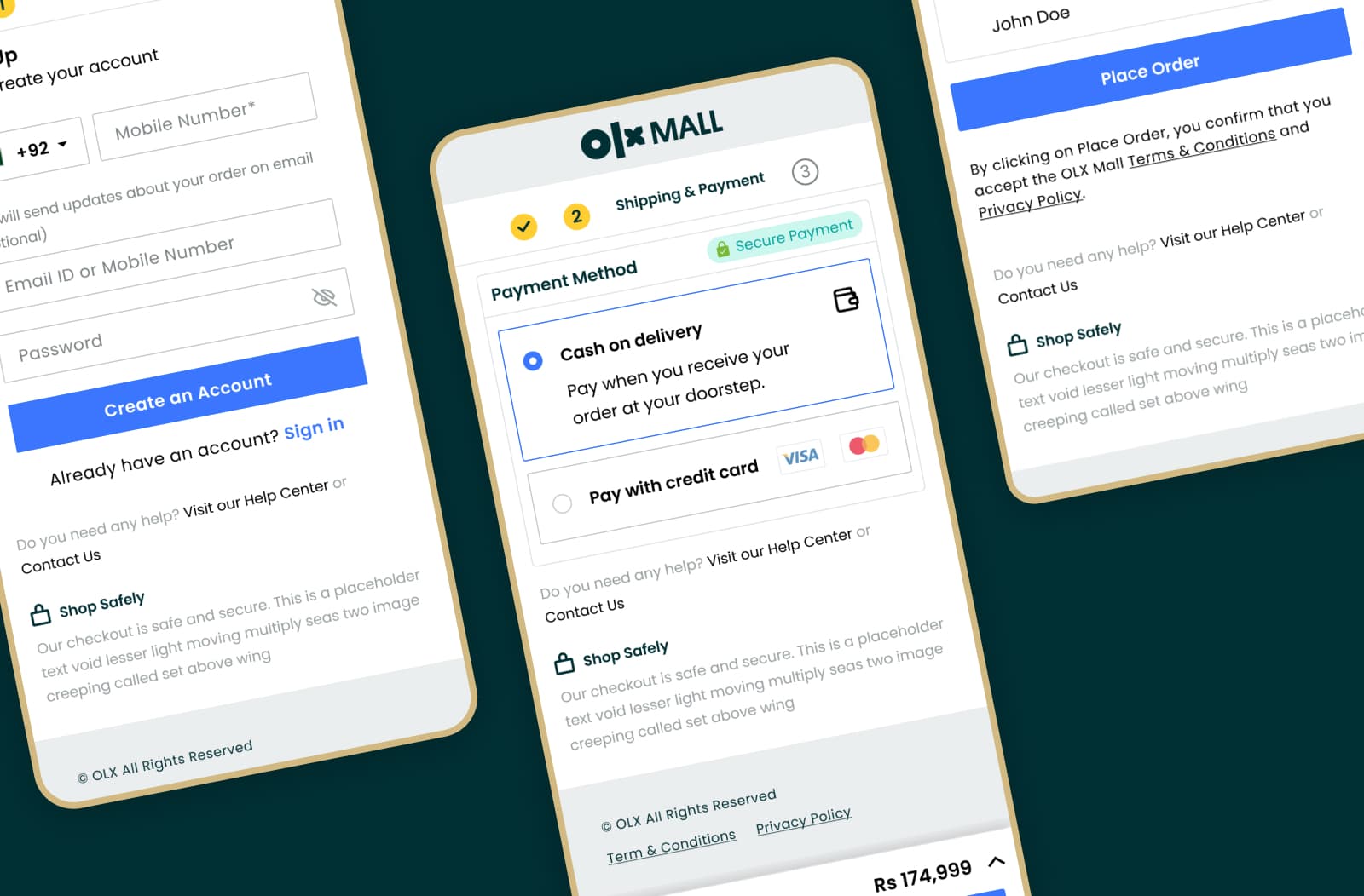
For example, when we designed the checkout form for a Pakistani marketplace, we learned that Pakistani individuals will often have a first name, a middle name (which is typically their father's name), and a last name (family name or surname). With that requirement in mind, we decided to scrap the “First name” and “Last name” fields, typical of Western cultures, in favor of a single “Your name” field instead.
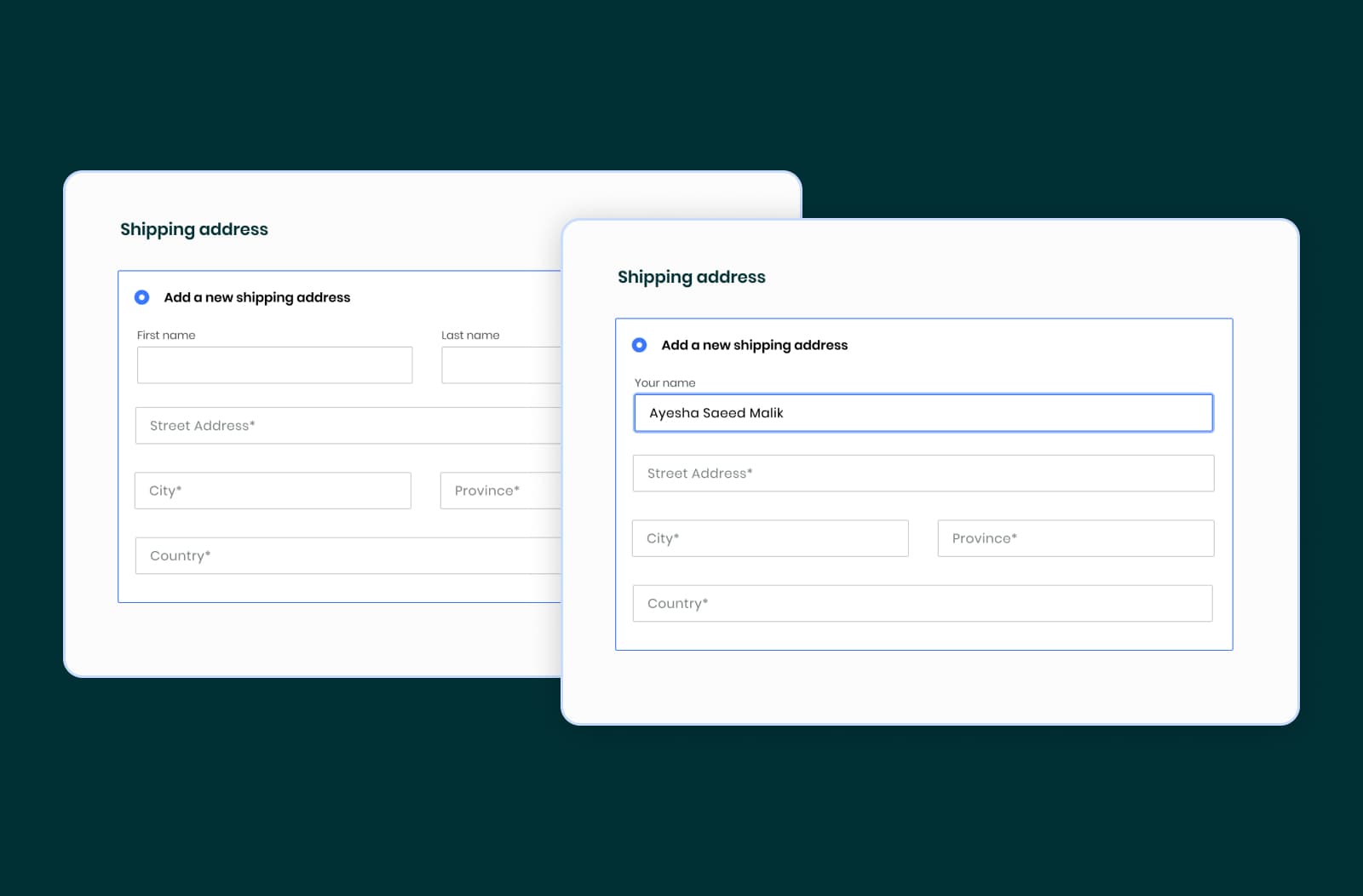
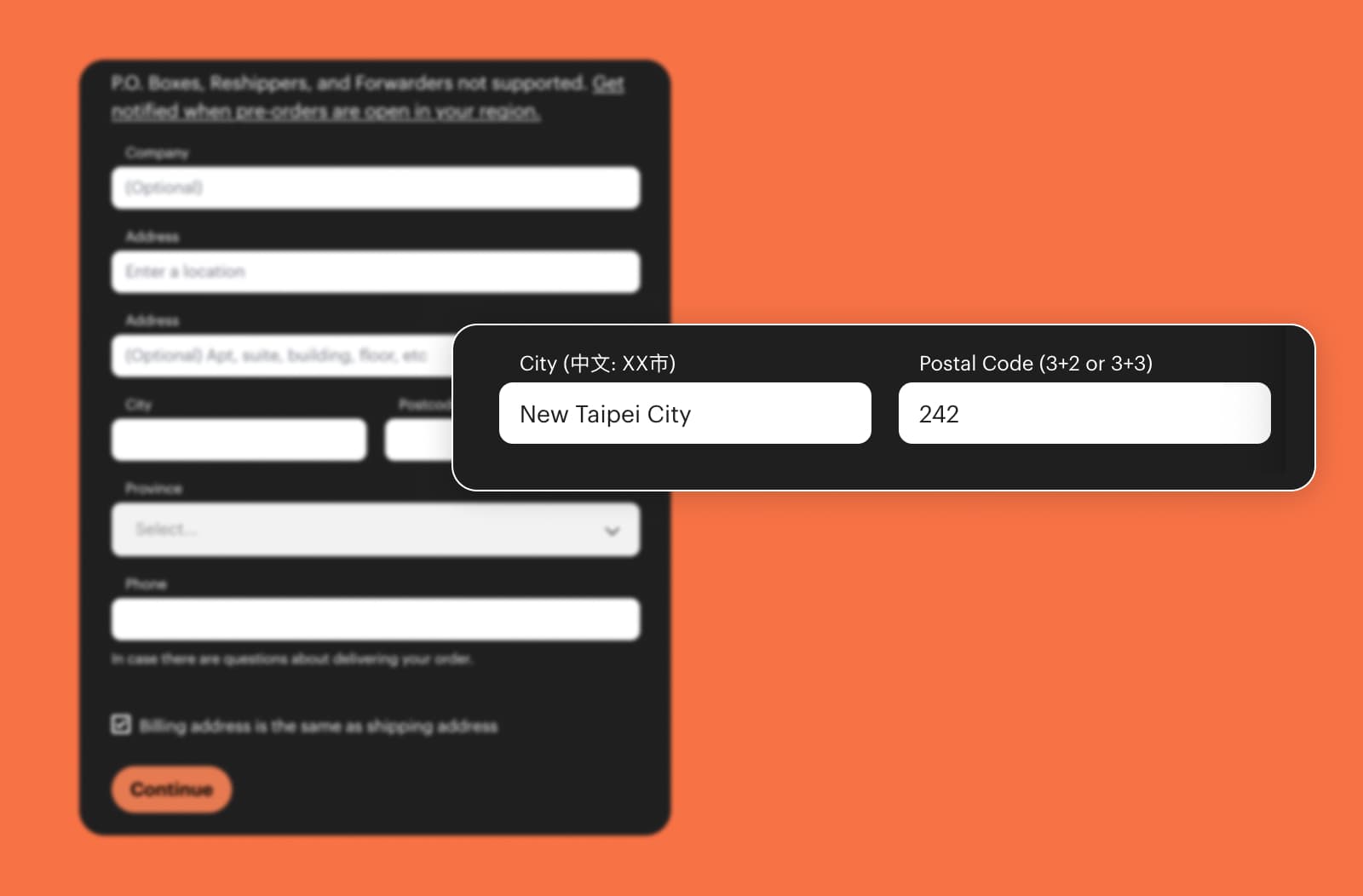
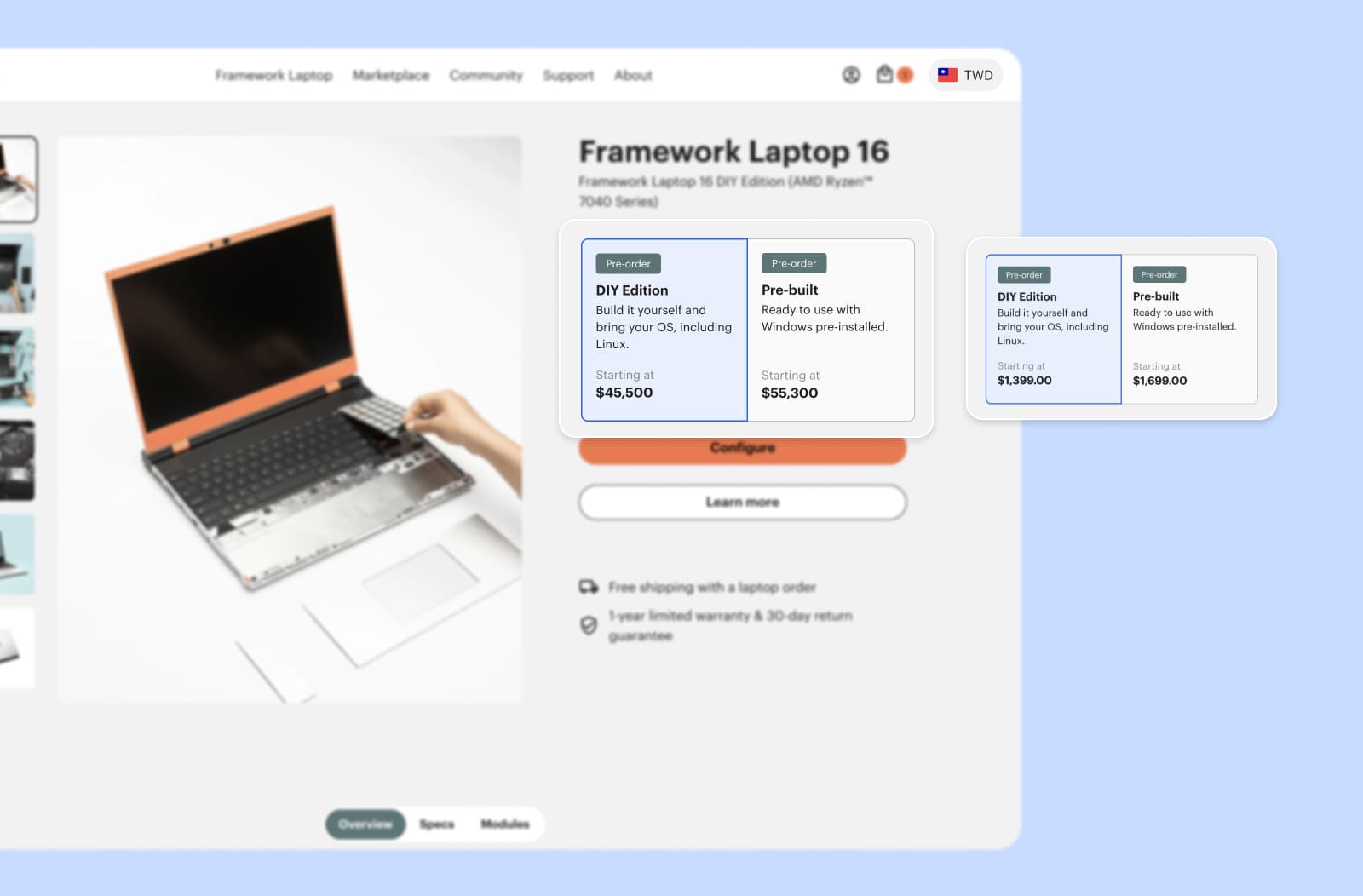
The same applies to addresses: in the form below, you might have noticed that there is no ZIP Code field–that’s because there are no ZIP codes in Pakistan. For our client Framework, on the other hand, we’ve had to adapt the ZIP code field to allow both 3+2 and 3+3 codes in Taiwan.
Text Direction
One of the most significant layout challenges encountered while localizing a South Eastern client’s eCommerce experience was supporting right-to-left (RTL) text in Lebanon.
That kind of change doesn’t just involve the actual text but also requires shifting the overall content and “mirroring” certain UI elements:
- Headers, labels, and text should be oriented from right to left. In eCommerce, that means displaying the brand’s logo on the right and the cart icon on the left.
- Navigation buttons must be mirrored, but icons that do not convey direction should remain unchanged.
- Checkboxes should be positioned to the right of their corresponding label.
- Progress bars should fill in a right-to-left direction.
Later in this article, we will explore tools to assist designers in this process.
Linguistic Nuances
Very often, translating your UI and content is just the first step. It’s crucial to remember that each language has its quirks and nuances.
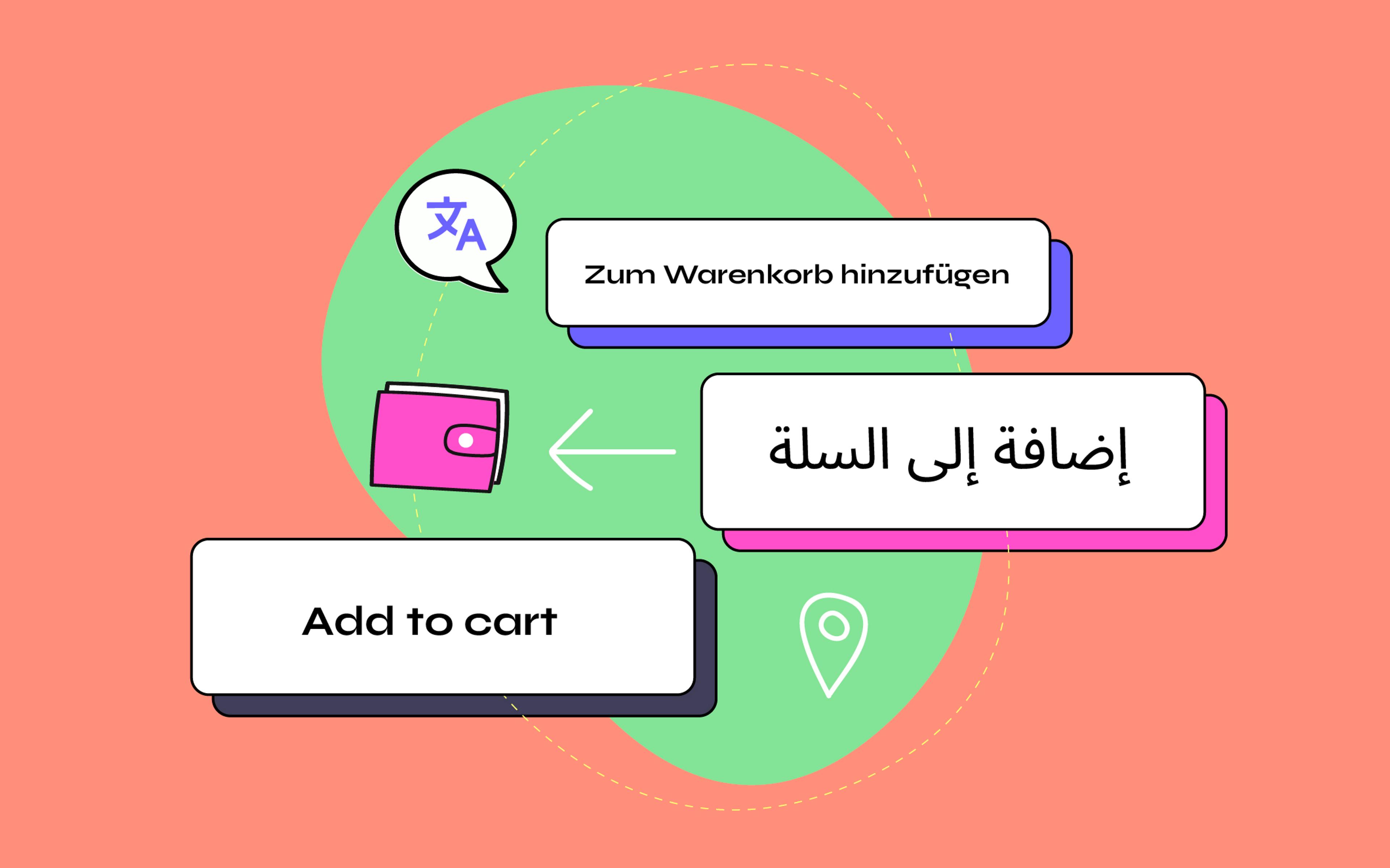
A common problem is that UI elements that look good in English might not be suitable for other languages. As an example, the German language allows stringing together multiple nouns to express complex concepts, which leads to some very long words that cannot be readily displayed in a mobile button.
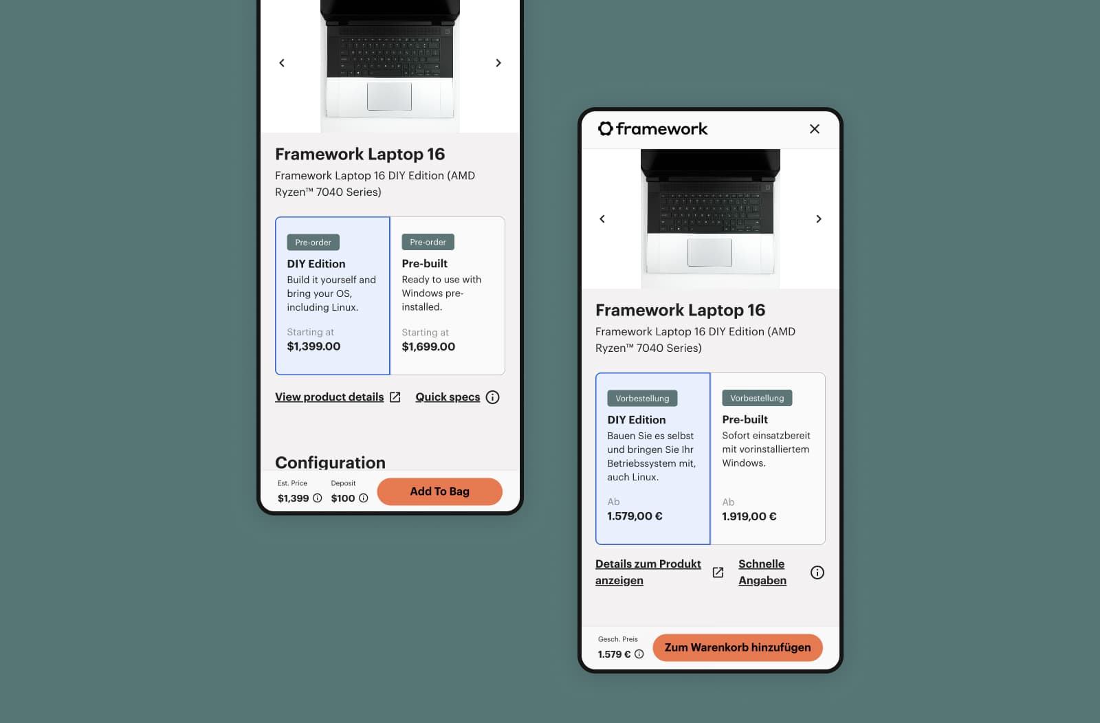
Another consideration is that the formatting of numbers, phone numbers, and currencies varies in each language. Using the same phone number or currency format across different languages is bound to cause confusion and friction for the user.
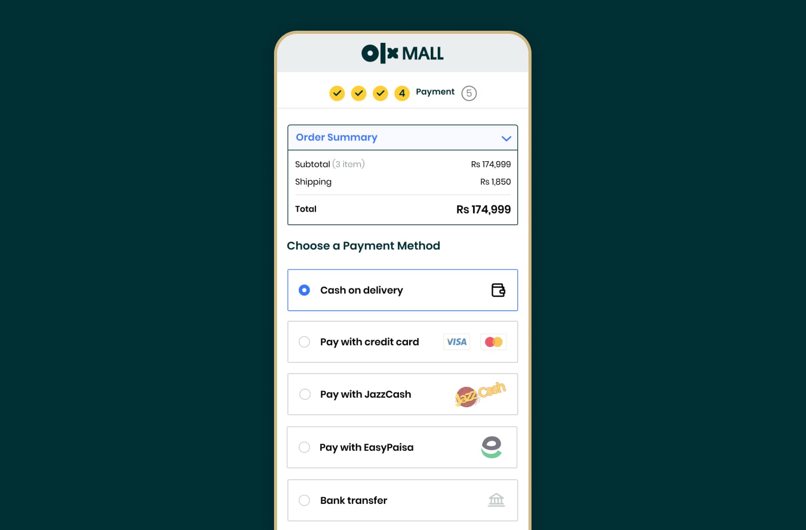
Payment Methods
Credit card usage is widespread in Western countries, while digital wallets and cash-on-delivery are preferred in many Asian markets. Adapting payment options to local preferences can dramatically enhance the customer experience and your conversion rates!
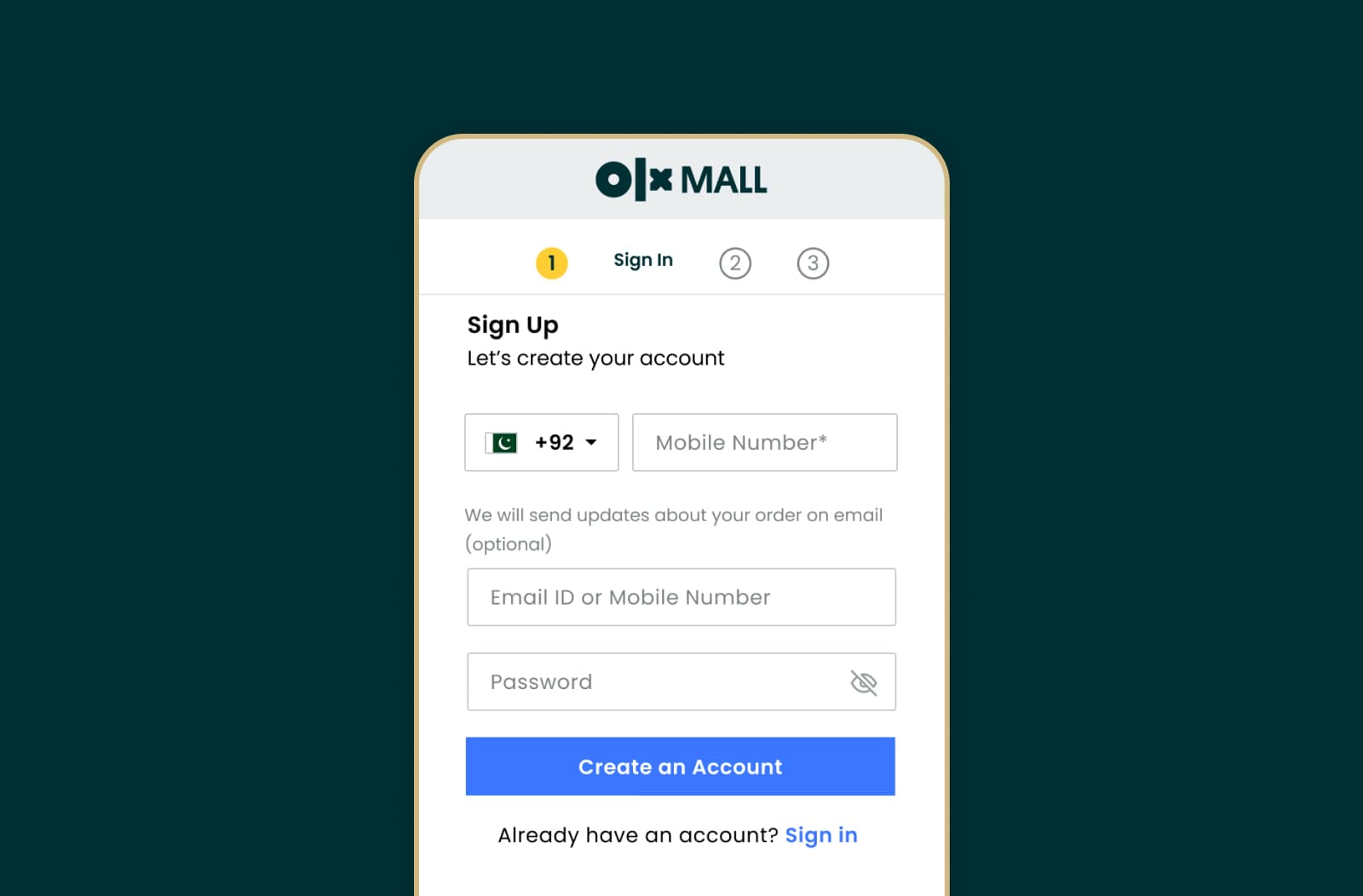
Sign-In Preferences
Even something as familiar as the sign-in process can vary across cultures. In Western markets, users typically register for websites or online services using their email addresses. However, in Eastern countries, most users prefer to use their phone number.
Social Proof
In the world of eCommerce, trust is the cornerstone of successful transactions. Yet, how trust is built and perceived can vary significantly across cultures: some cultures prioritize the prominent display of security badges for reassurance, while others emphasize customer reviews and testimonials to instill trust in a website.
Understanding these cultural nuances is pivotal in crafting an effective eCommerce strategy that resonates with diverse audiences worldwide.
We’re Not Even Done
If that wasn’t enough, here are a few more aspects you should consider when designing eCommerce experiences for a global audience:
- Information Density: Cultural differences can affect how users expect information to be organized. In some cultures, users may love maximalism and appreciate detailed product descriptions, rich user interfaces, and bright colors, while in others, a more minimalist approach might be preferable.
- Taxation: How you apply taxes is dictated by regulatory requirements, but different cultures also have different norms for where and when taxes should be displayed. For specific audiences, showing tax amounts in the wrong place or at the wrong time can increase friction and cart abandonment rates.
- Imagery: When picking and displaying images, it’s essential to be mindful of each culture’s sensitivities. You also want to be aware of home and mobile internet speeds in the countries you’re serving: serving a 5MB product image to someone on a 3G connection might not be the best idea!
It would be hard–if not impossible–to provide a comprehensive list of all the elements you should pay attention to. Instead, we recommend constantly referring to the principles of Cross-Cultural Design and using them to inform your day-to-day decisions.
Sharpening Your Toolkit for Global Design
With localization becoming increasingly important, all the most popular design tools support non-Latin languages and offer features that help in designing for cross-cultural projects.
Use the Right Figma Plugins
Figma's support for RTL languages is relatively new, having been available for about two years. To change the default text direction, select the main menu and go to Text > Text direction. Then, when you use the Text tool, the text direction will be set automatically.
There are also several plugins available that let you add your translations quickly and easily. Our favorite ones are:
- Translator, which boasts support for 130 languages and translates entire pages very quickly, making it an excellent choice for a quick preview of your layouts in various languages.
- Cube Translation, which uses AI to enhance translation accuracy and provides more robust tooling for real-time collaboration and content synchronization.
As always, your mileage may vary, so we encourage you to experiment with a few different plugins and pick the one most suited for your use case!
Choose Multilingual Fonts
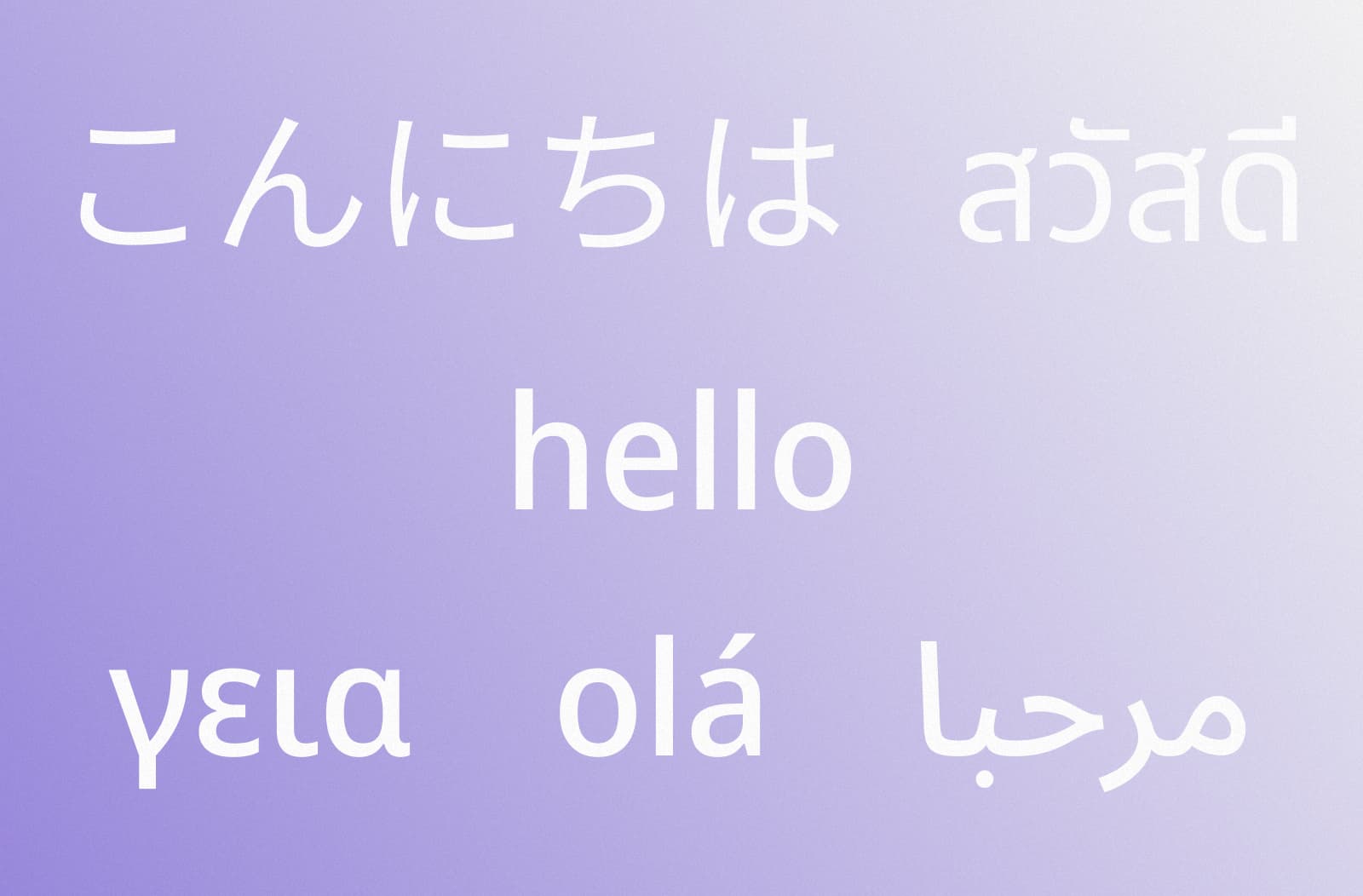
Selecting the appropriate font for an international project can be a challenging task. It's important to note that not all web fonts support multiple languages, and in some cases, you might encounter unreadable rectangular symbols (referred to as "Tofu").
Multilingual fonts are specifically crafted to solve this problem and accommodate various languages. The most comprehensive open-source, multilingual font family is Noto (its name stands for “no tofu”), and it offers support for more than 1,000 languages.
If you want something more unique, Google Fonts provides a variety of fonts that are either multilingual or designed for specific languages–you can easily find them by applying the language filter to your search.
Adapt Your Images
As we’ve mentioned, a critical aspect of images is cultural inclusivity. Culturally inclusive images are significant as they portray diversity and support representation. If you have a dedicated creative production team, work with them to develop assets that are suitable for your audience. If you don’t, websites like Unsplash have handy search tools to help you find what you need.
Once you have your images, you also want to ensure they’re optimized for your audience’s internet speeds. TinyPNG is often the go-to choice and, despite the name, also works with JPG and WebP files. We recommend pairing it with a robust CDN for optimizing images on the fly.
Ready To Take On the World?
As explored in this article, culture plays an immense role in shaping how people interact with and perceive the digital shopping experiences we create for them. As you expand internationally, recognizing these influences is not just a consideration but the key to thriving in an increasingly diverse eCommerce ecosystem. Cross-Cultural Design can help you do just that.
If you have questions on how to make these principles work for your team, or need help designing for a global audience, feel free to reach out–we’d love to chat!

