Case study
Worn In, Not Worn Out: Rebuilding Sebago’s Store for 8% Bigger Orders
Sebago in numbers
- ~50pages launched autonomously
- +14%items per order
- +8%average order value
Named after a nearby lake, Sebago started in 1946 in Westbrook, Maine. Their original product: hand-sewn penny loafers. Then came the Docksides, the boat shoes worn by Steve McQueen, Paul Newman, and college students all over the country.
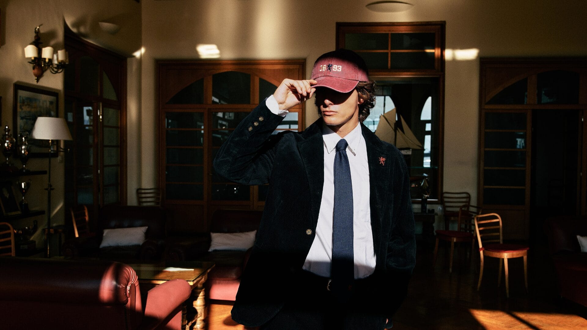
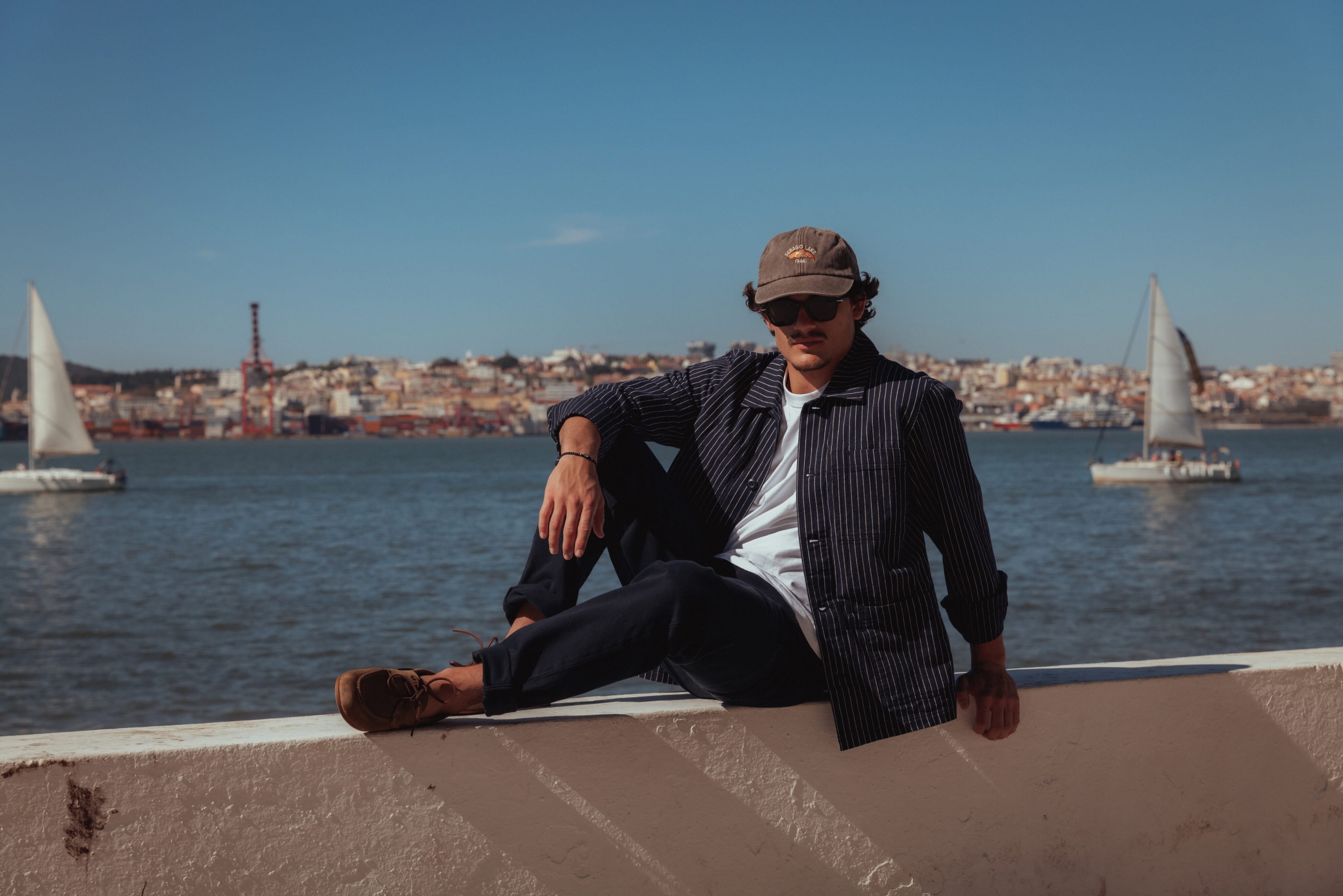
Eighty years on, Sebago came to us to relaunch that heritage online. Their team believed that their archive deserved more than an About page, and their shoes more than a product grid. Instead, they wanted a store where brand and product could coexist and reinforce each other.
The challenge: content slows shoppers down, which is why most stores keep it well away from the purchase funnel. We knew that bringing it into the catalog would require giving the brand room to speak without ever standing between a shopper and the right pair. So we got to work.
industry
services
platform
Awards
“From the start, we wanted to bring our archive, campaigns, and catalog together without losing what makes the brand recognizable. We wanted the new store to bring Sebago’s history front and center while also helping our customer find the right shoes.”
Pasquale PassaroHead of E-commerce @ SebagoHeritage, translated for the screen.
Sebago had a logo, brand colors, and decades of photography, but no rules for type, spacing, or motion on a screen. Without them, every page would be designed from scratch, and the store would drift a little further from the brand with each campaign.
So we started from Sebago’s Yearbook, a printed mix of catalog and magazine full of archive photos and ads. We studied how its pages introduce a product, how much room they give a photograph, and how the copy speaks. Then we carried that logic into a type scale, roomier layouts, and motion suited to the brand, and on into the store’s navigation and category structure.
The result is a digital flagship that reads like the Yearbook: the next campaign starts from its rules instead of a blank page, and shoppers meet the same Sebago on every page.
Stories you can shop, shoes with a story.
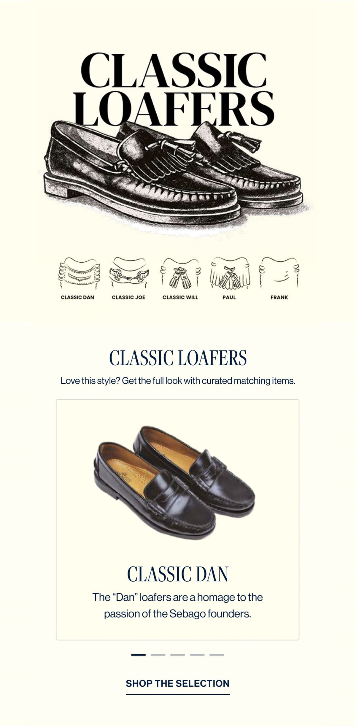
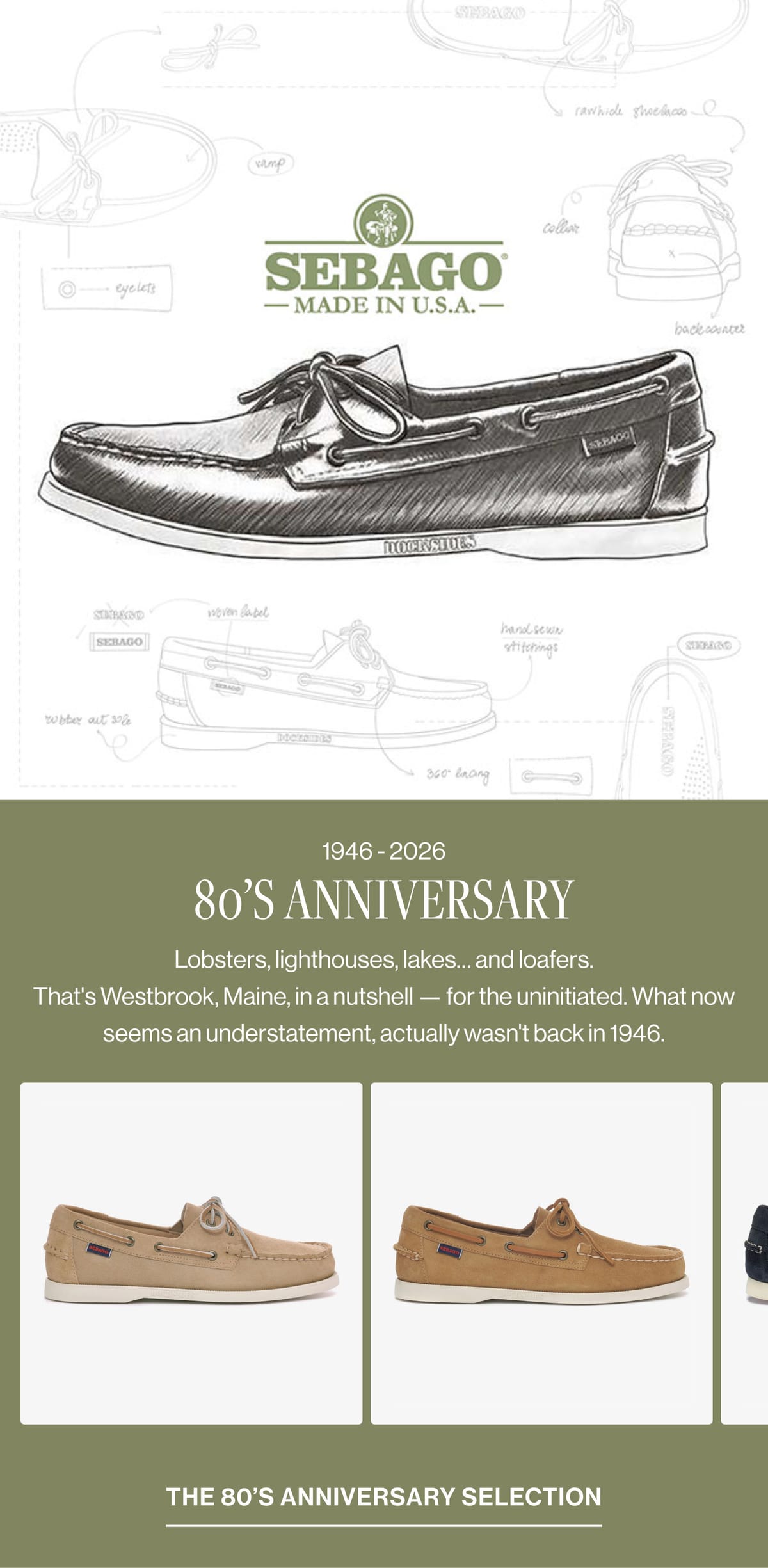
Sebago needed to tell its story inside the shopping experience, not beside it. The anniversary campaign belonged next to the shoes it featured, and a loafer had more to say than its price and sizes. Story and catalog would have to work in both directions, long after launch.
In the UI kit we built, campaign content sits inside collection grids and product pages, campaign pages carry the products they feature, and the same modules bring a shoe’s story, materials, and care onto its product page. The palette, type scale, grid, spacing, and motion live in theme settings, so any arrangement follows the design system.
The result: Sebago’s team builds a campaign in the theme editor without asking a developer for a new page. A shopper can move from the anniversary story to the shoes in it, and back.
Everything a good shop assistant would tell you.
Buying shoes online stalls on size and fit. A shopper who can’t tell whether their size is in stock, or how a model fits, usually stops browsing. In a shop, someone would answer those questions and suggest what to wear with the pair. Online, the store had to do both itself.
So we put the answers where shoppers already look. A size filter follows them down every collection, and a pair goes into the bag straight from its card. On the product page, fit advice and store availability open beside the shoe. “Complete the look” suggests what to wear with it, both on that page and in the cart.
Someone eyeing a pair of Docksides can now find their size, check the fit, see which store has them, and leave dressed for the deck.
“Nebulab worked closely with our team to turn the design into a store we can keep building on. We now put together campaign pages ourselves in the theme editor, and our product pages finally have room to explain what goes into each shoe.”
Pasquale PassaroHead of E-commerce @ Sebago